Logo & Visual Identity Design for Caco Marin Estúdio
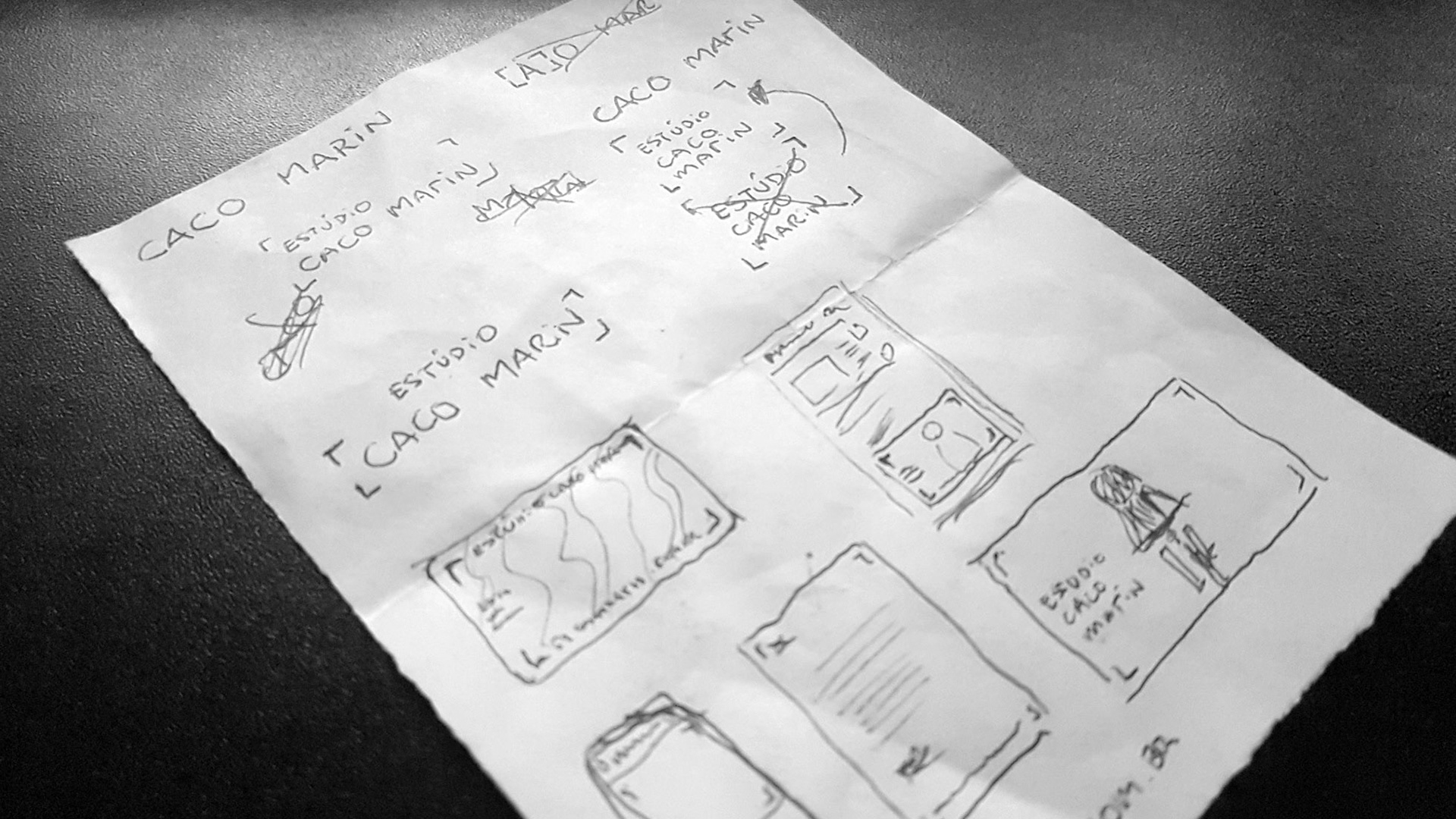
Caco Marin is a multidisciplinary photographer residing in the south of Brazil. I was challenged to create his photography studio's visual identity without any obvious elements such as cameras, lenses, eyes, etc.
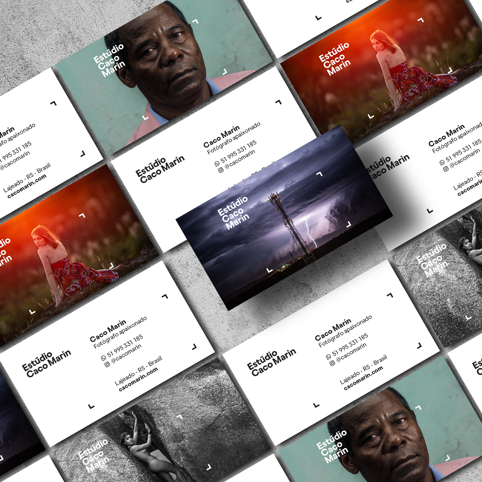
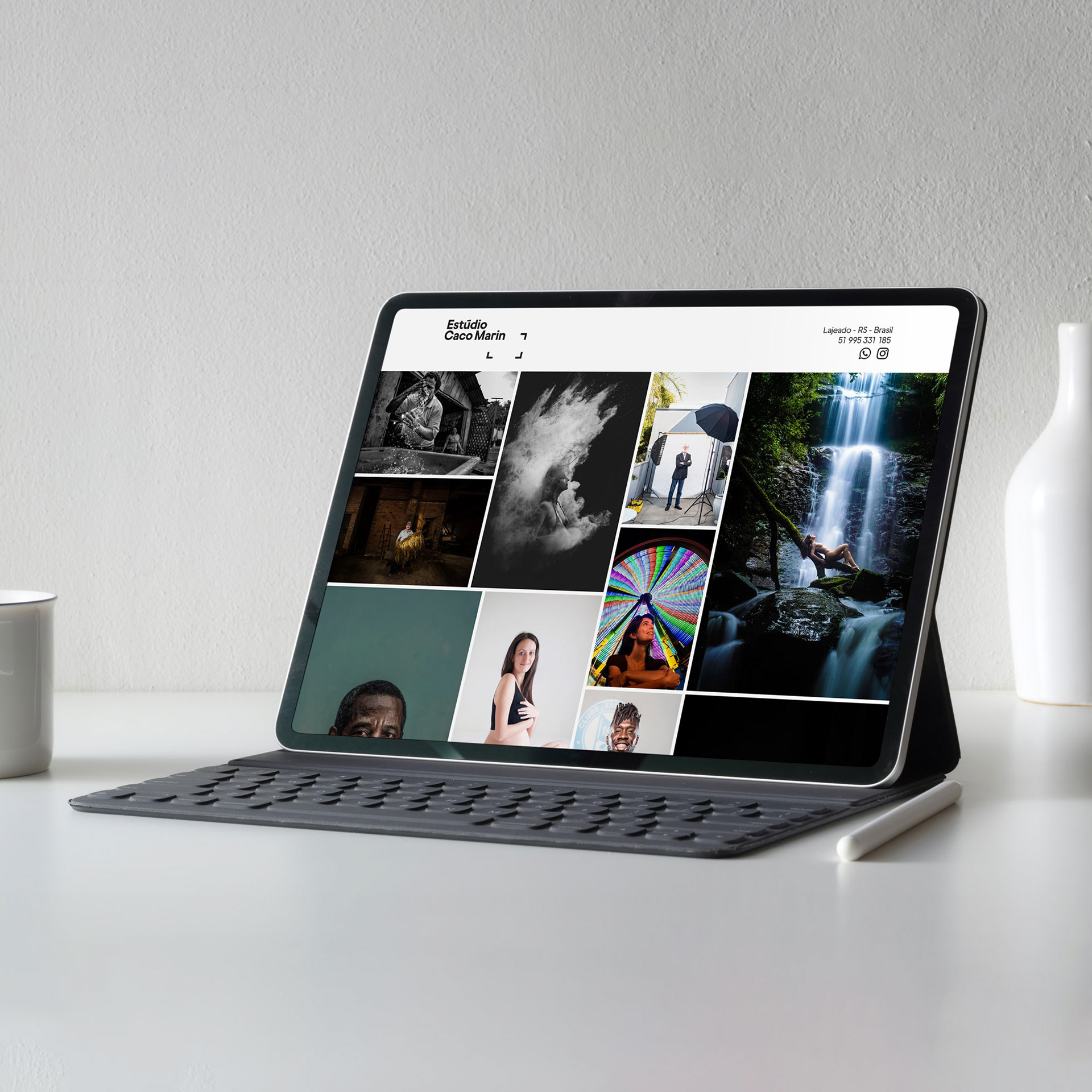
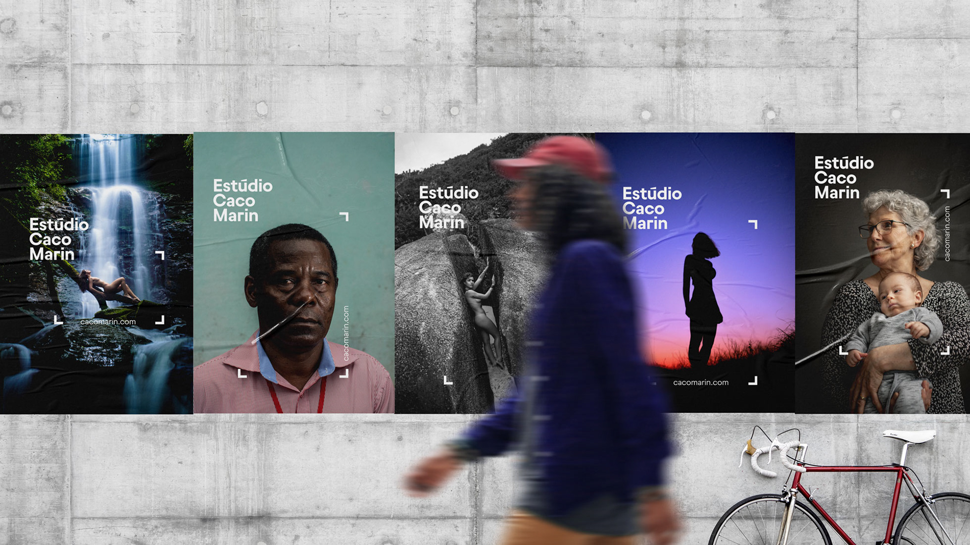
His photography speaks for itself, having strong influences from his beginning in photojournalism. Lots of negative space, even in portraits and product photography. That specificity in his work cleared the space I needed to create a unique and mutating visual identity.
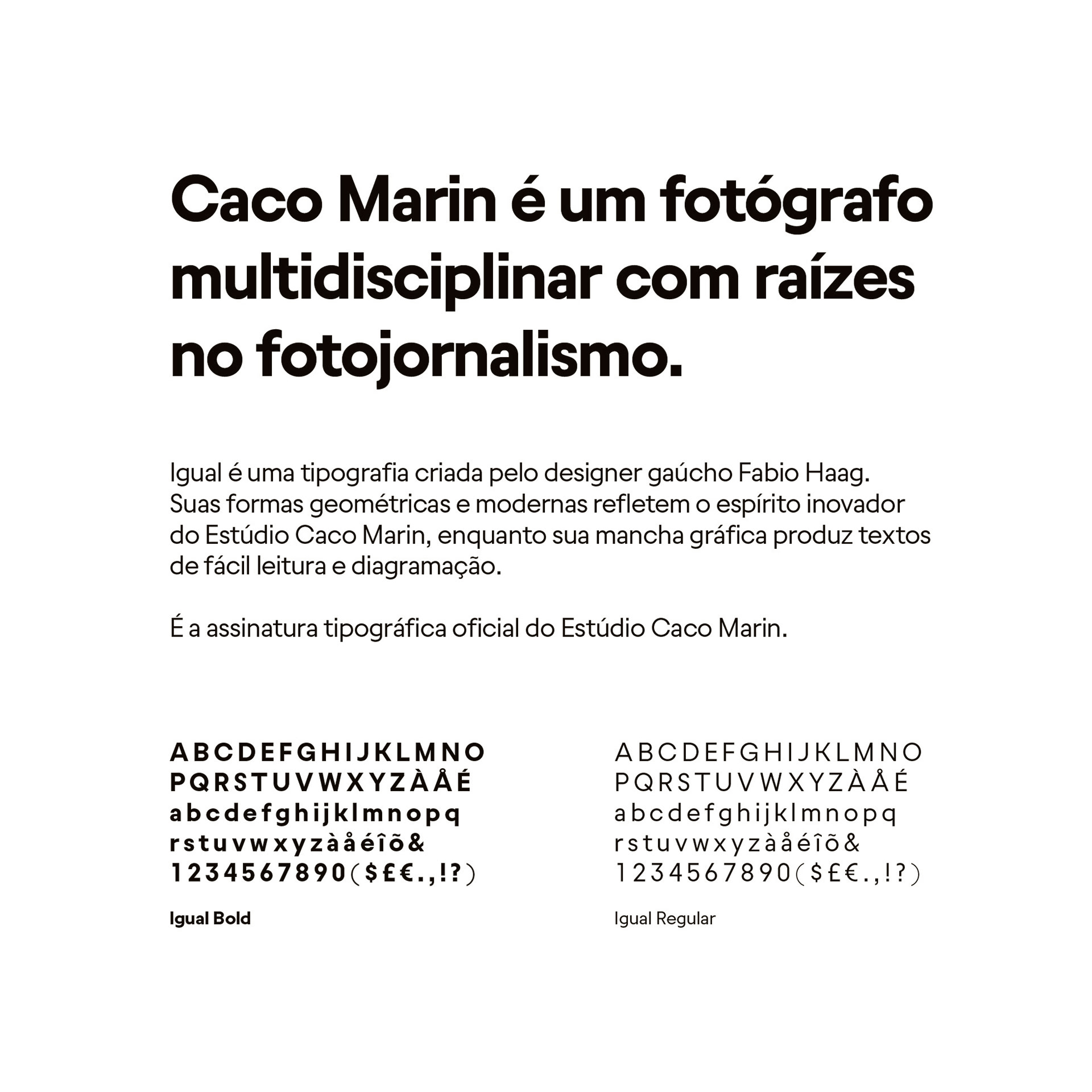
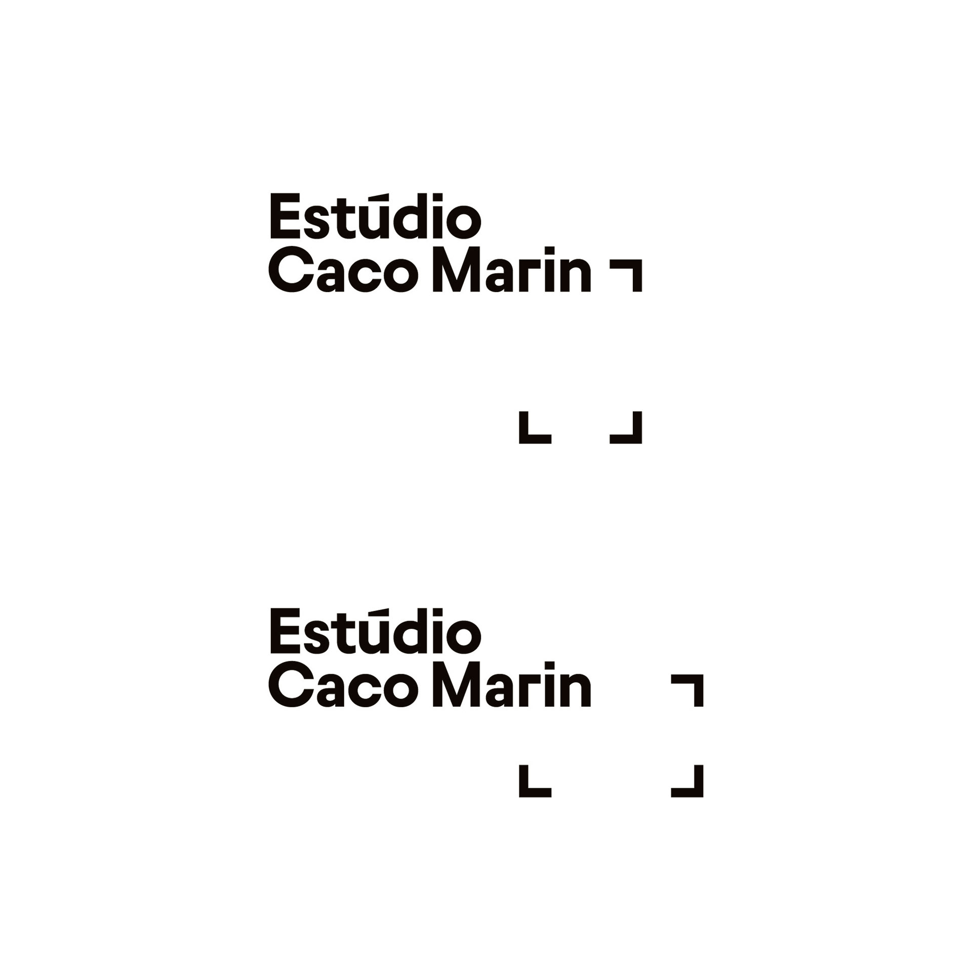
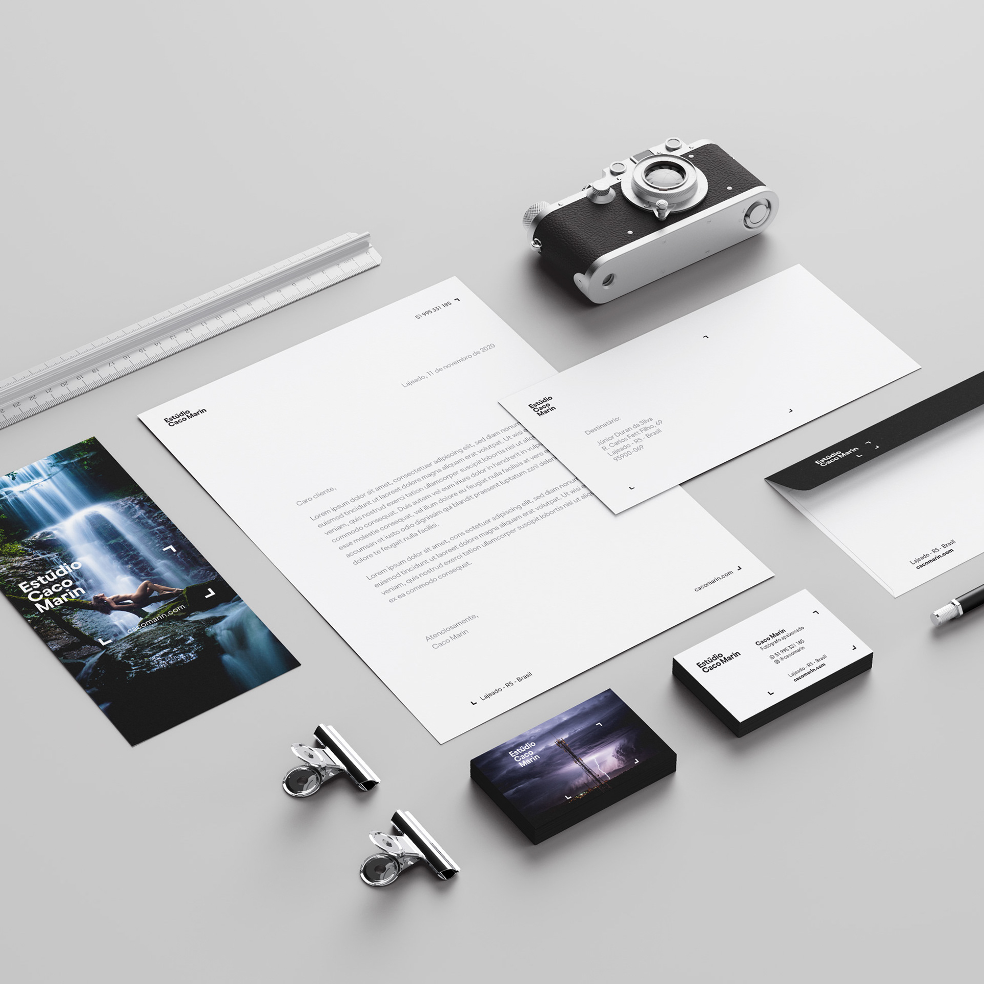
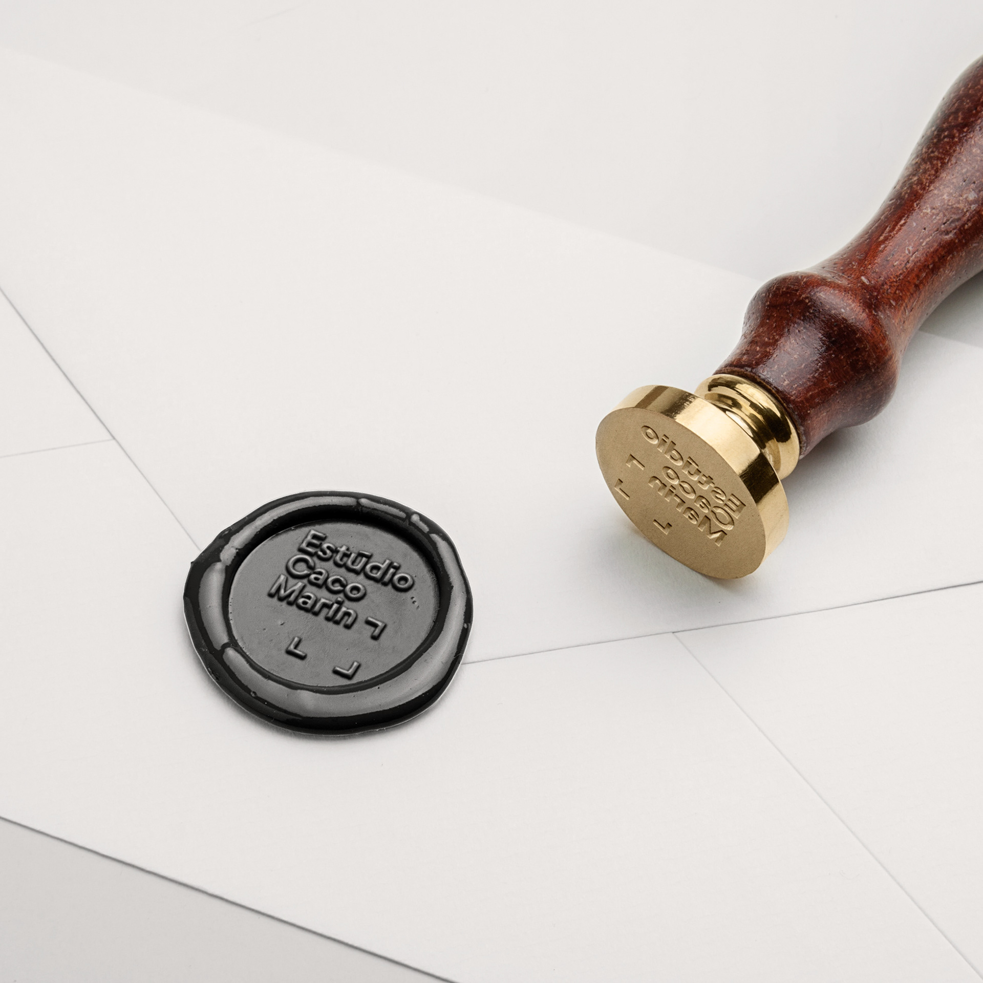
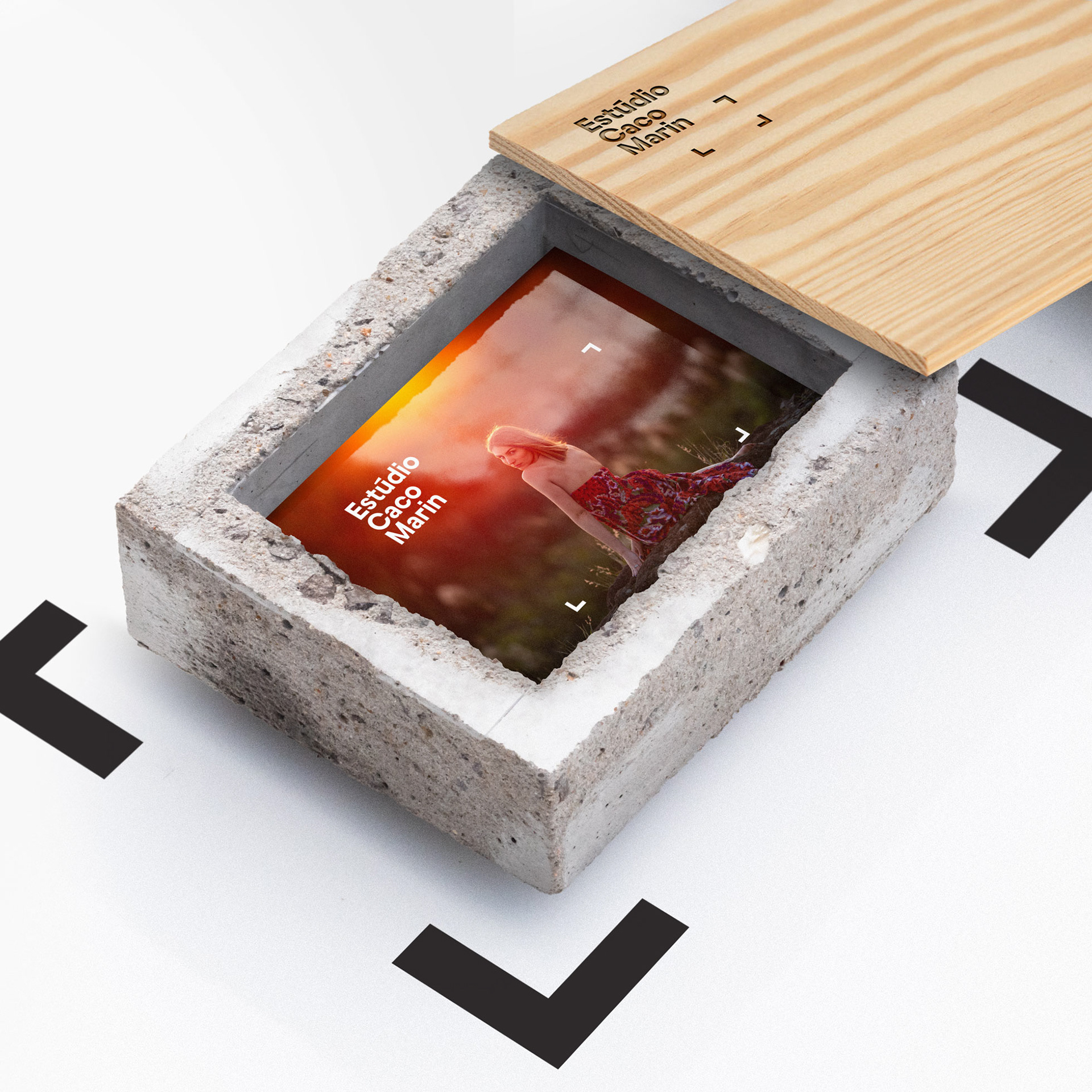
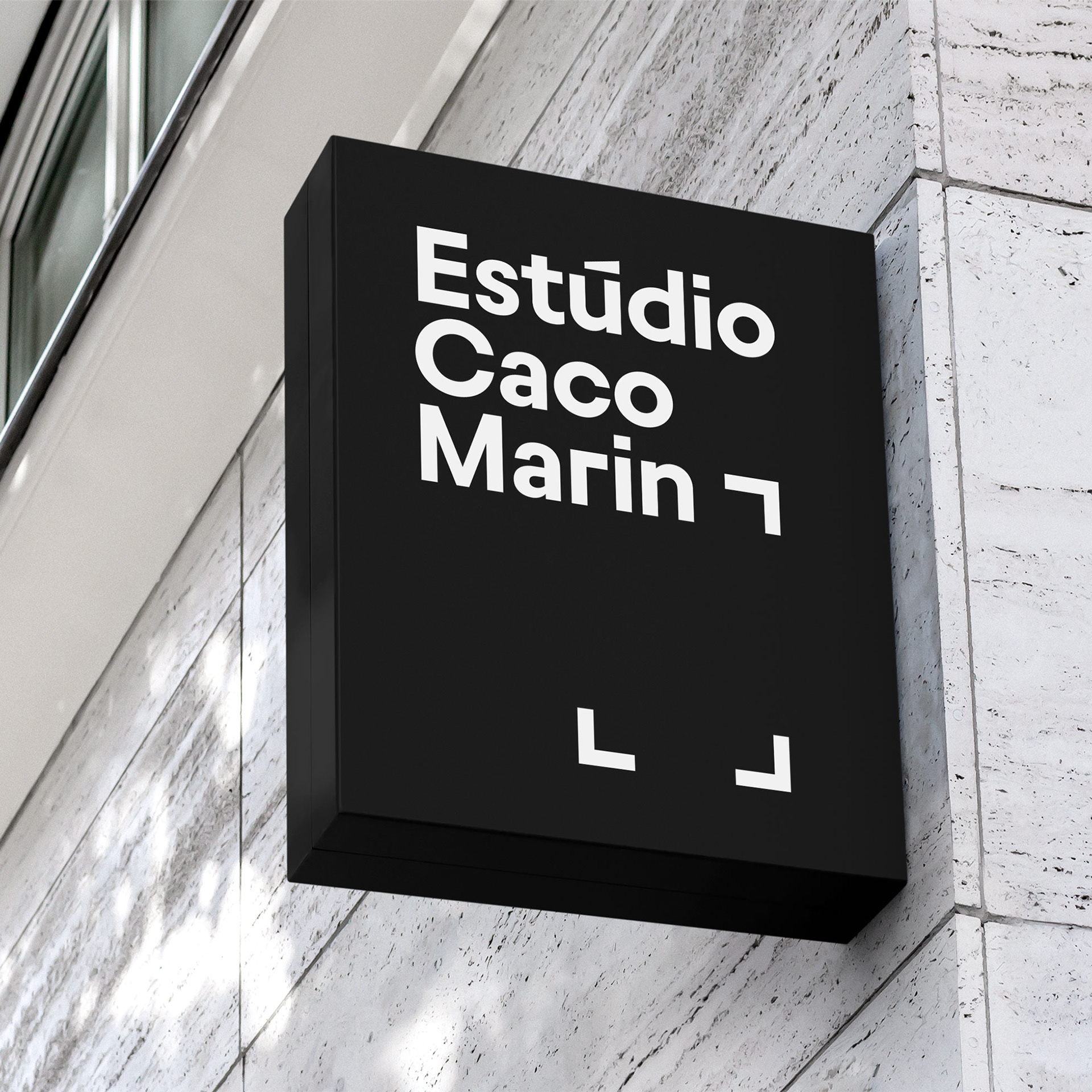
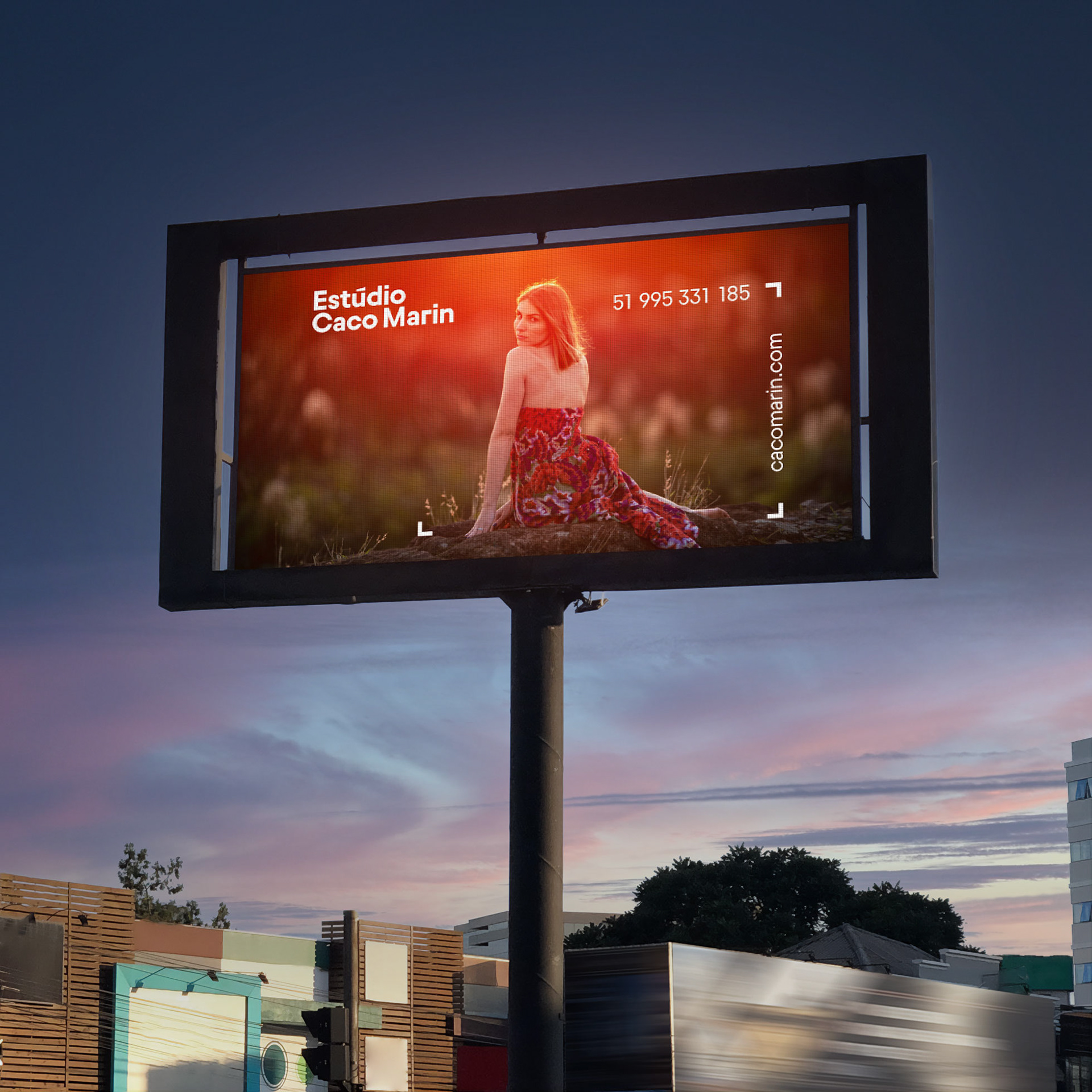
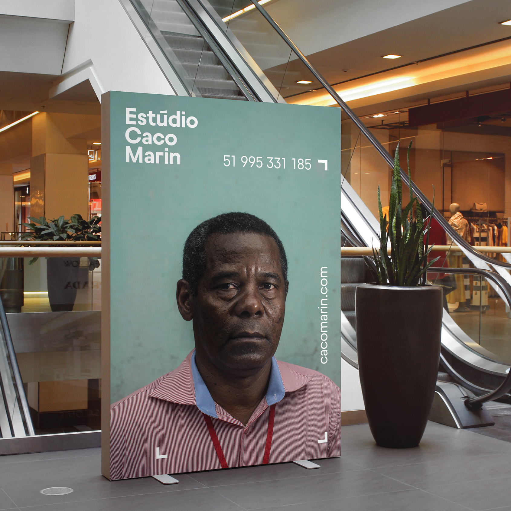
The logotype, set in Igual, a typeface by Brazilian type designer Fabio Haag, is clean, strong and striking. Igual's geometric clean shapes contrast very well with Caco's work and doesn't create any interference. It's more of a signature than a brand, and that was the main objective. The stylized lowercase 'r' is part of a bigger focus rectangle that expands to highlight specific parts of his photographs when applied on them.
The overall effect is that the logo communicates with the pictures without interrupting their message, but rather bringing attention to them. It makes his pictures and skills stand out even more. A simple framing that brings his work to another level without taking anything from it.