Logo + Visual Identity for a Brazilian-Korean Architect
KA MA Arquitetura is the studio of Elisabete Ka Ma, a Brazilian-Korean with excellent taste specializing in architecture, interior design, and renovation.
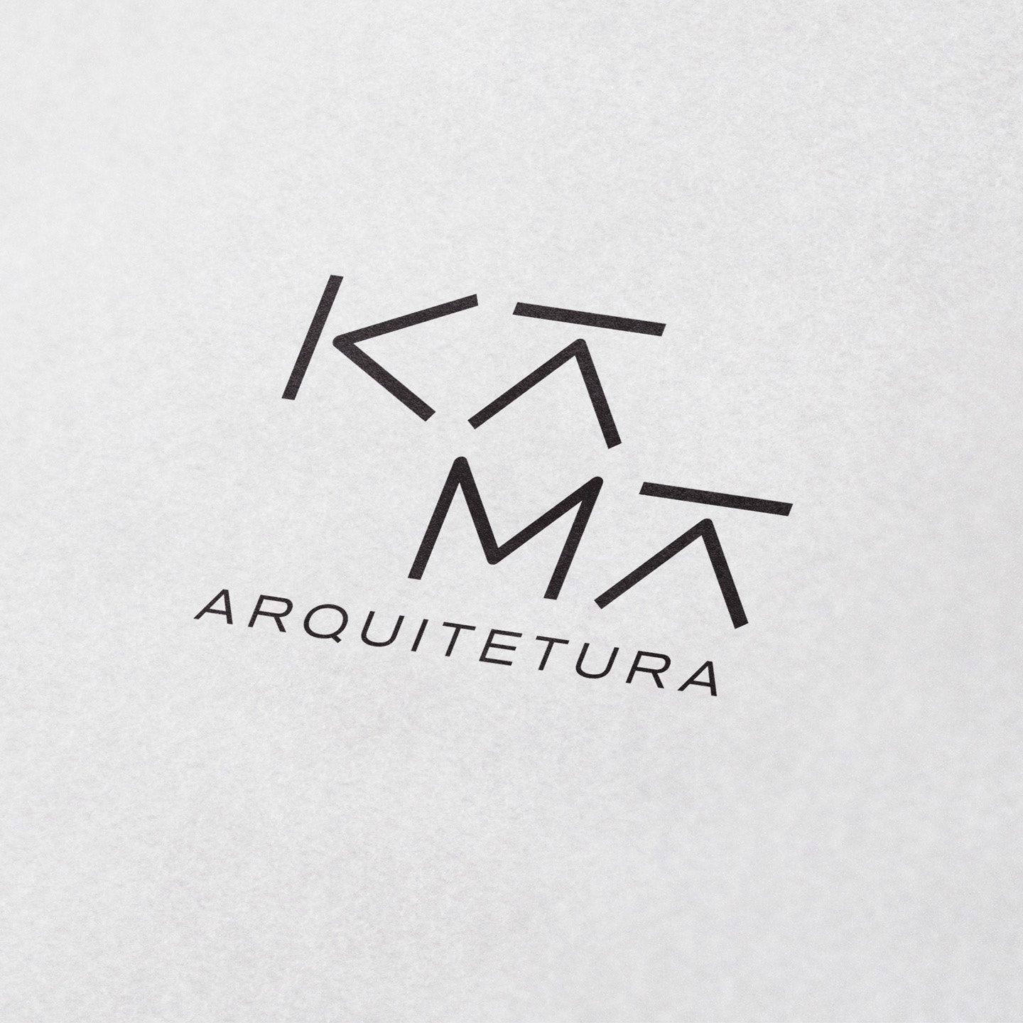
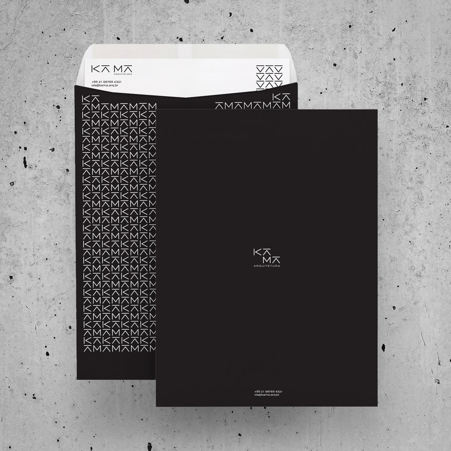
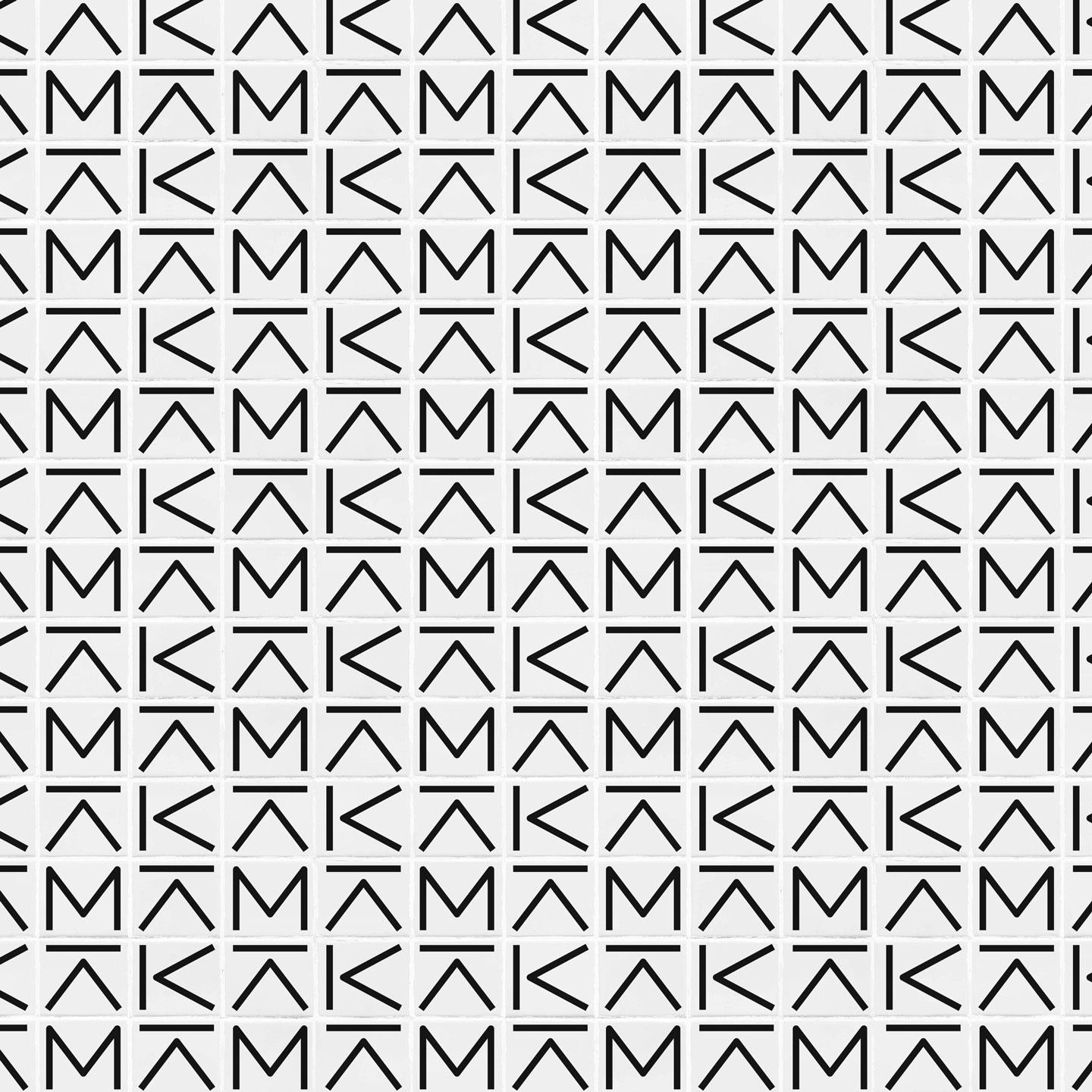
The goal of the visual identity system was to have a clean yet distinctive custom logotype to sign her projects and recall her Korean roots. The custom letterforms in the KA MA logotype were inspired by Korean typography and glyphs as well as in elements from architectural plans such as lines and sharp corners.
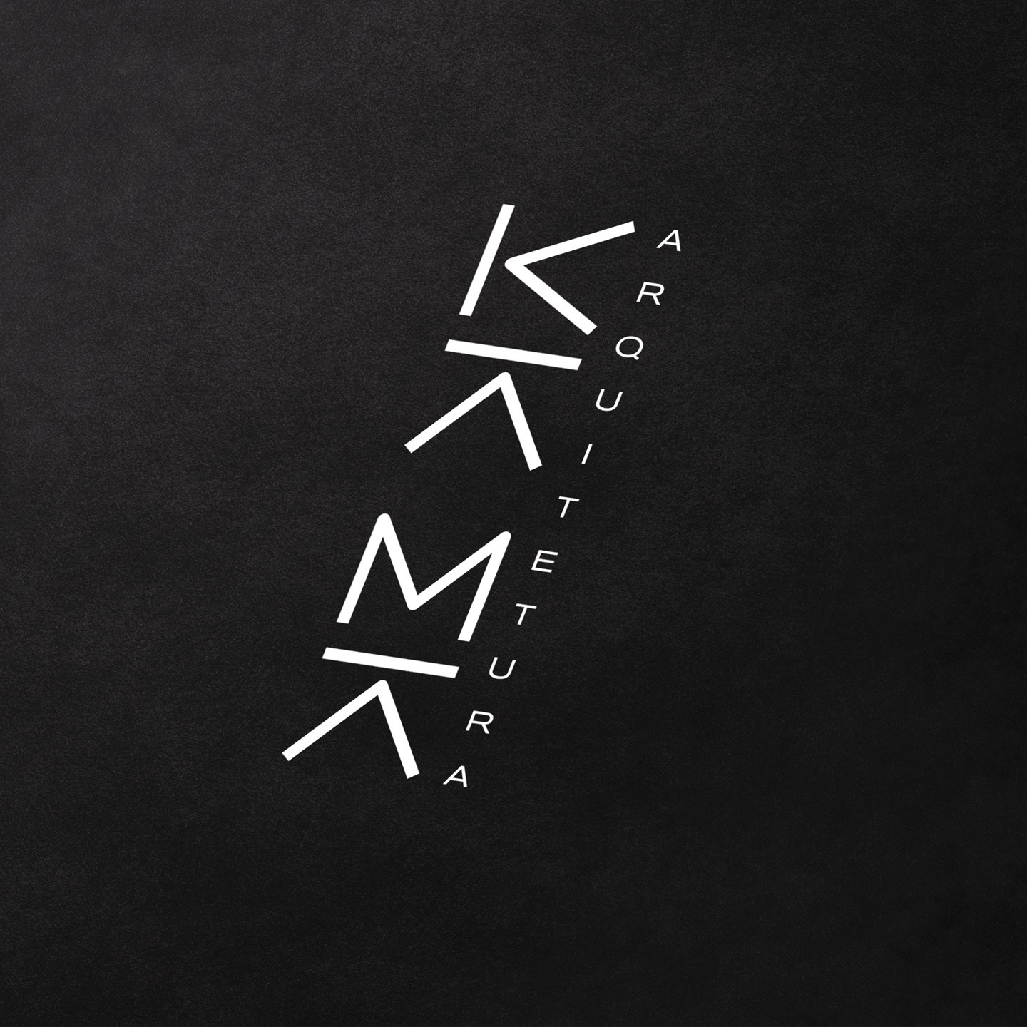
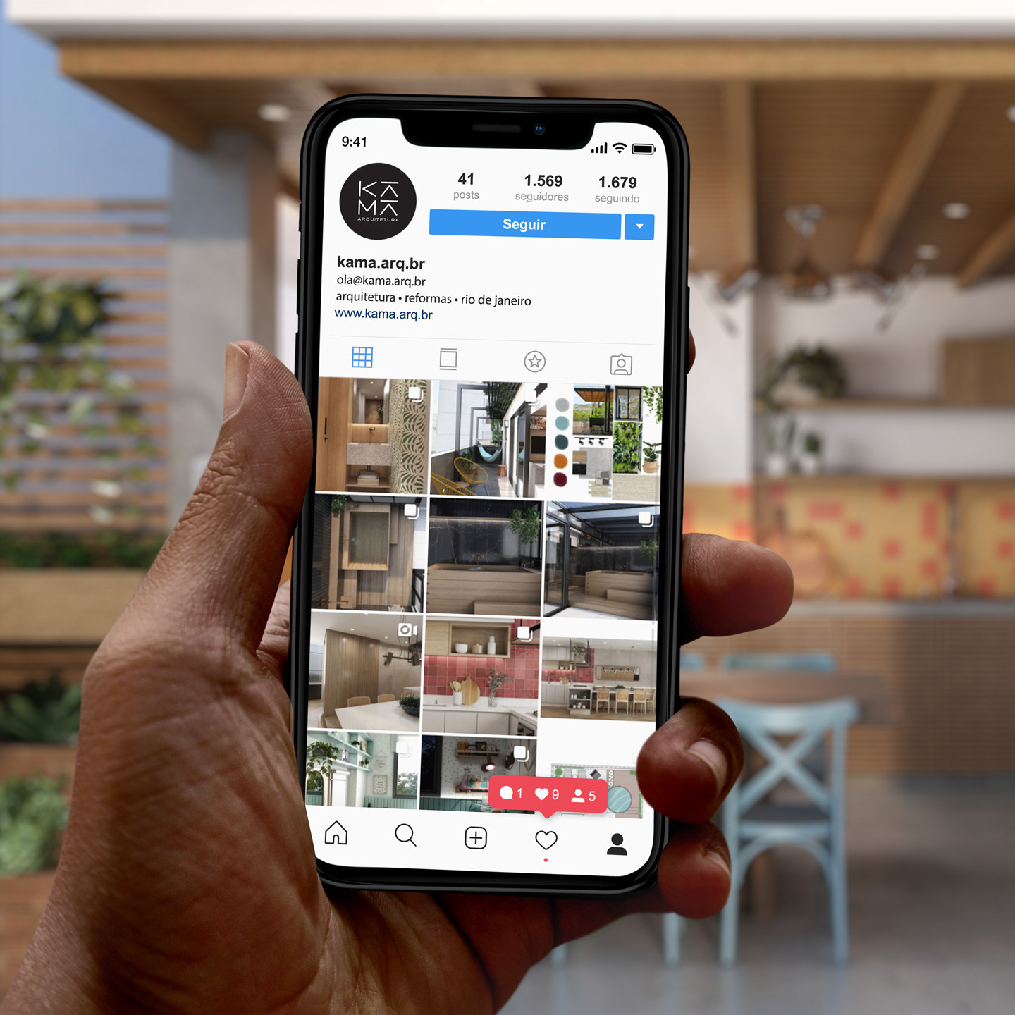
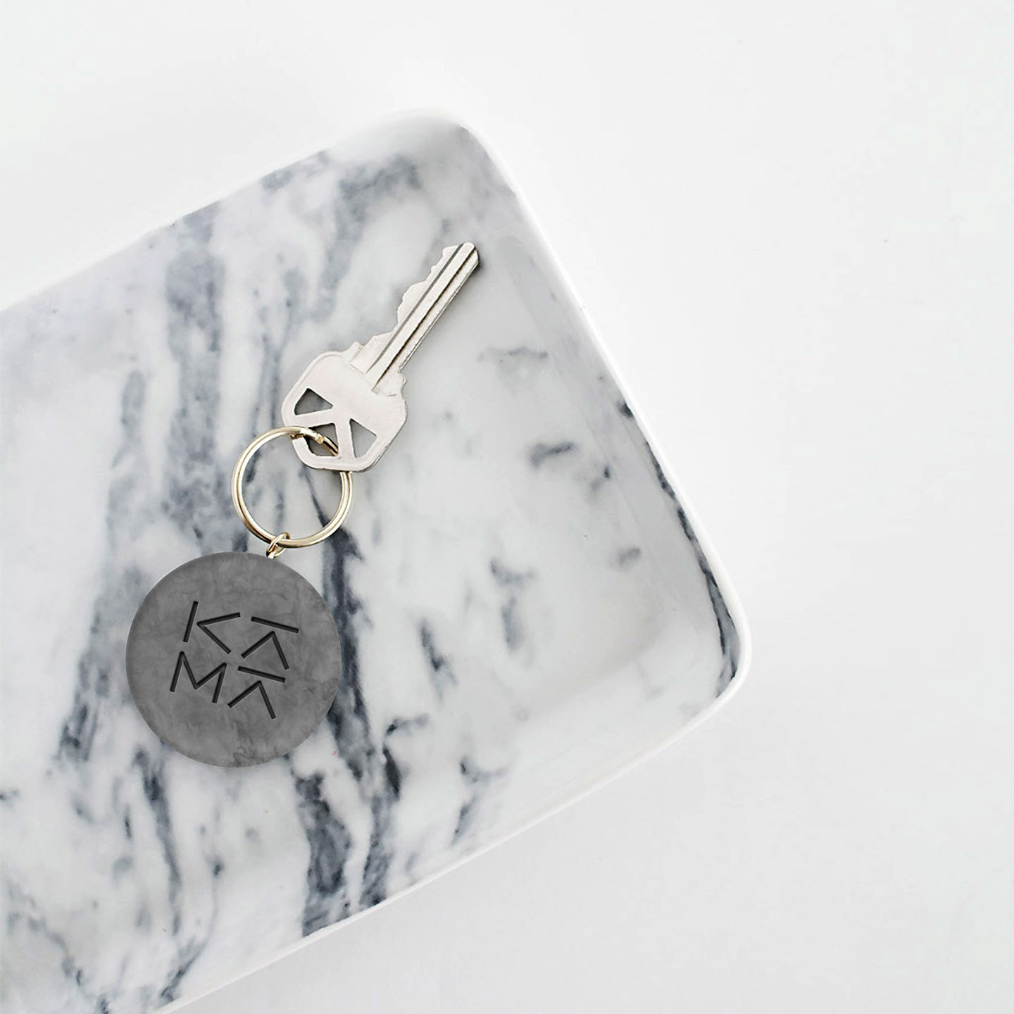
The resulting letterforms are easily arranged in several different configurations like the vertical one commonly used in Korean writing and signage, as well as helping it fit in small places like Social Media avatars and helping it easily blend in as a signature for her projects and portfolio images.
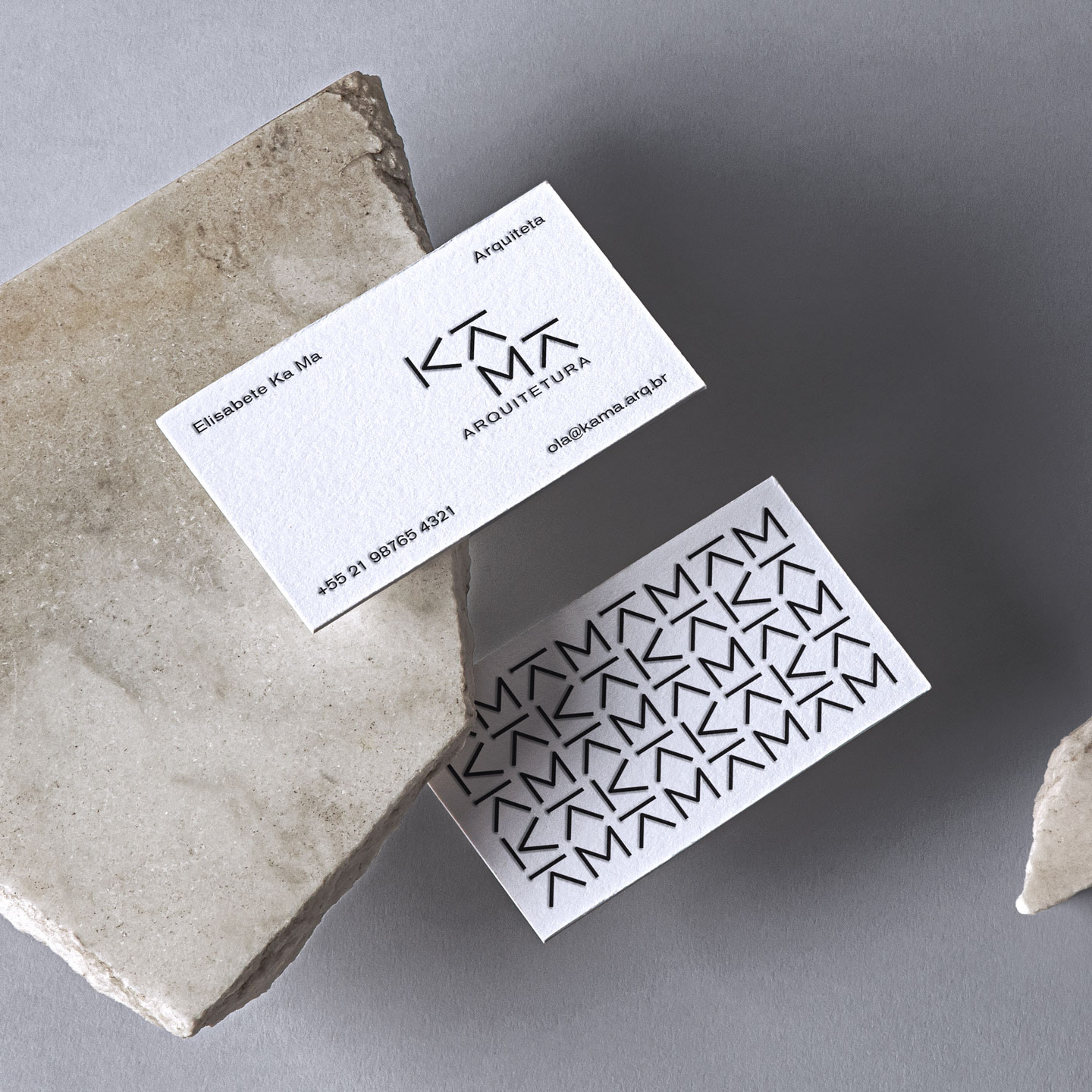
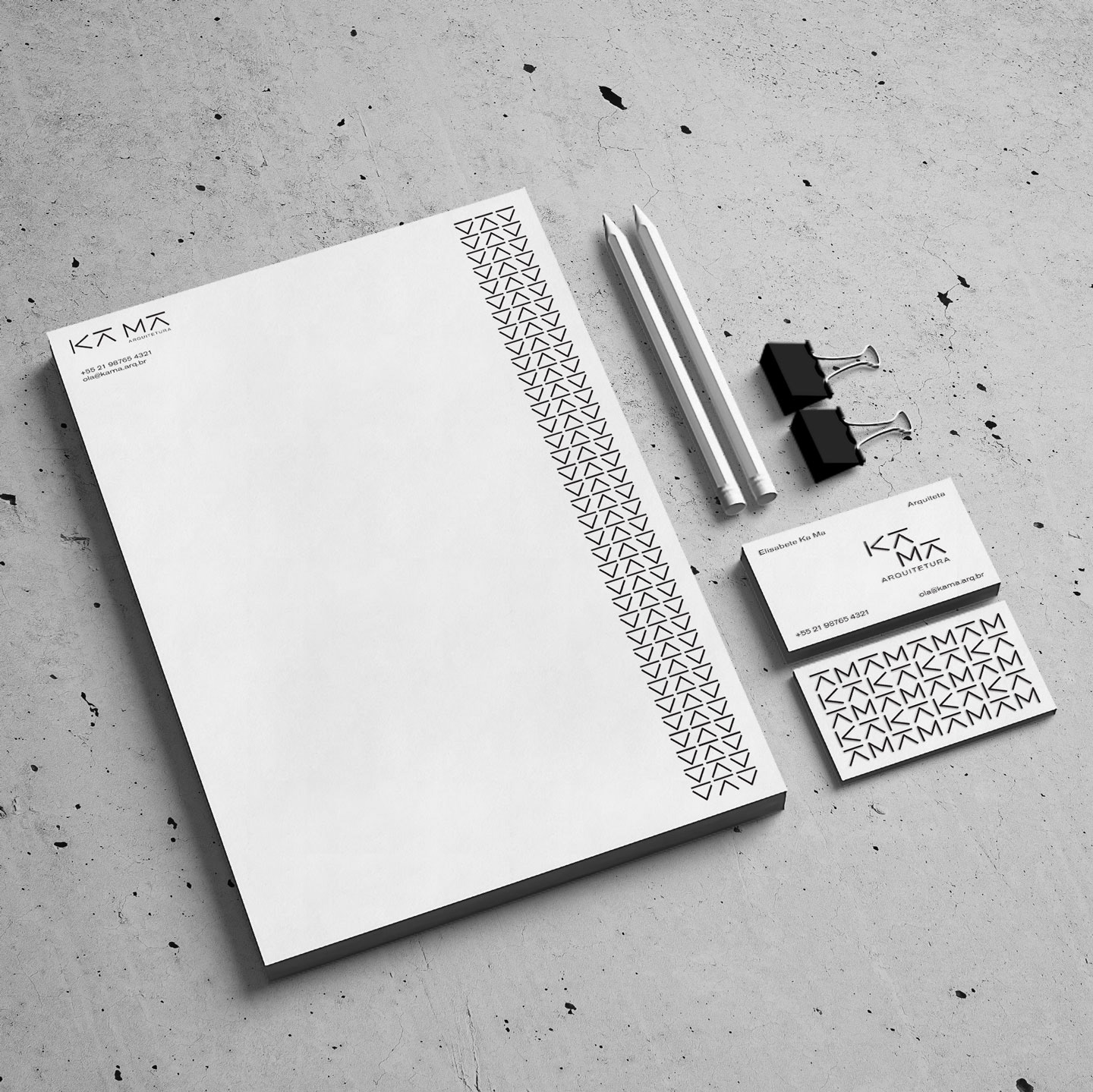
The KA MA Pattern can also be arranged in several ways and using any of the 4 characters in the name, making it a strong point in the Visual Identity System and helping her brand stand out and making her stationery very distinct and enjoyable. The letterpressed business card makes a statement when delivered and enriches the experience while also having the handmade feel that she gives to her projects.