Logo & Visual Identity for a Chemical Manufacturer
I was hired by Morama Branding to design the new visual identity for Grupo Química.
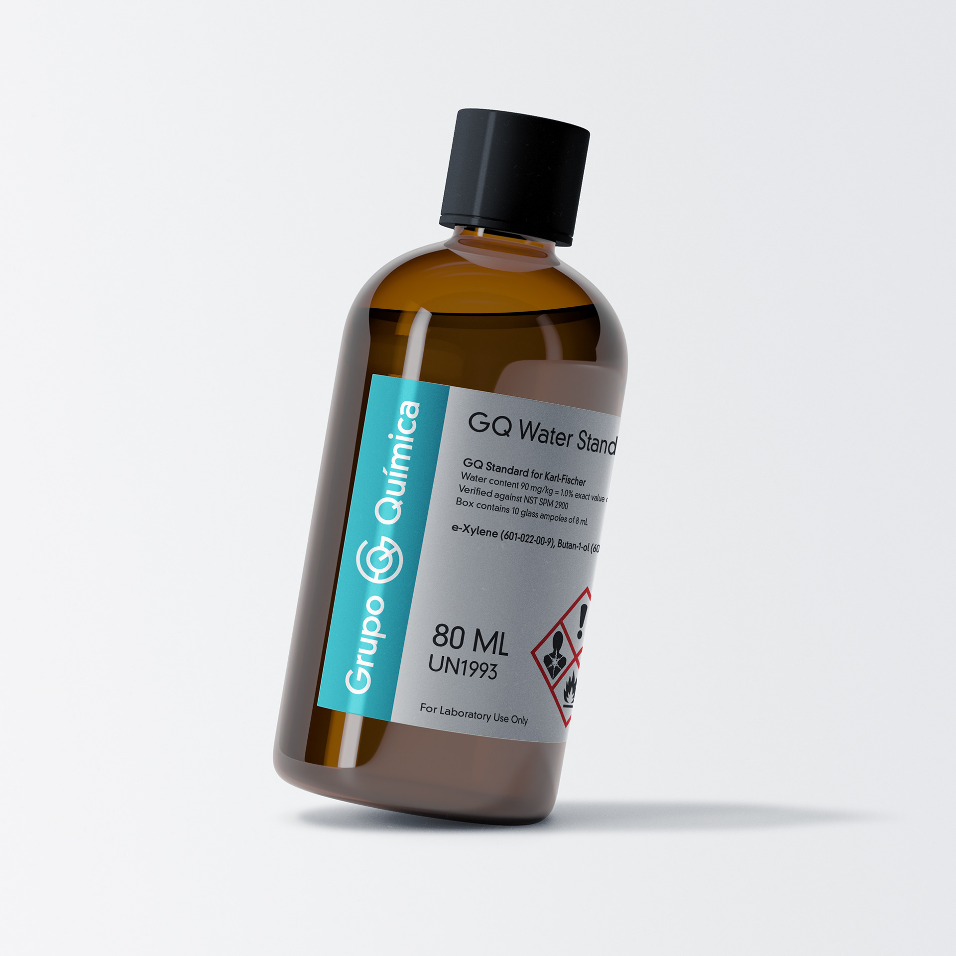
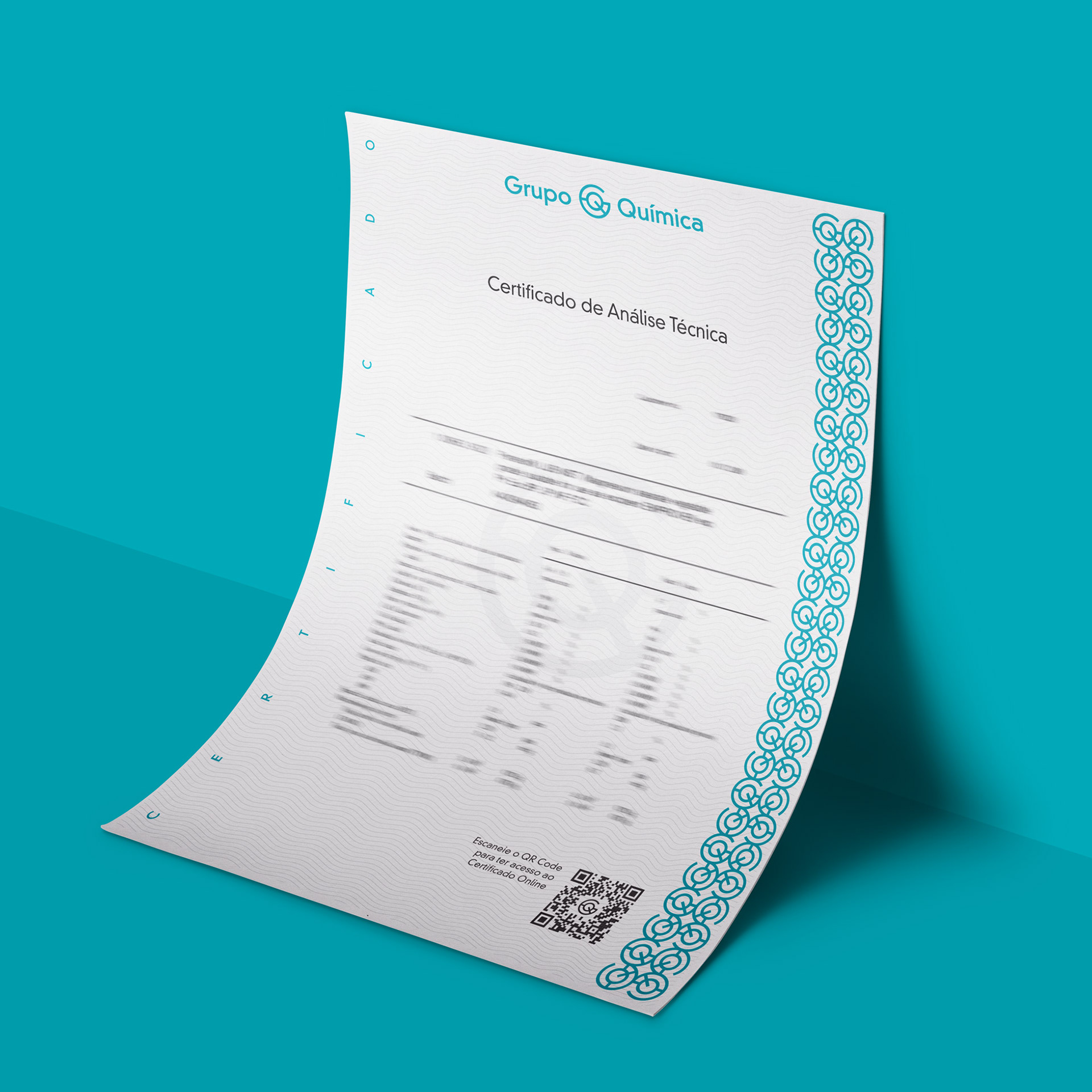
Grupo Química is a chemical product manufacturer belonging to the Carvalhaes Group, a chemical and laboratorial reseller in southern Brazil. They produce, certify and sell several chemicals for lab and general use.
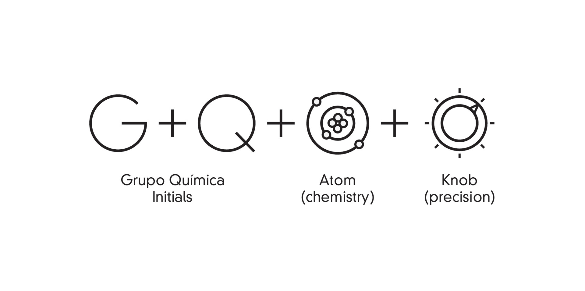
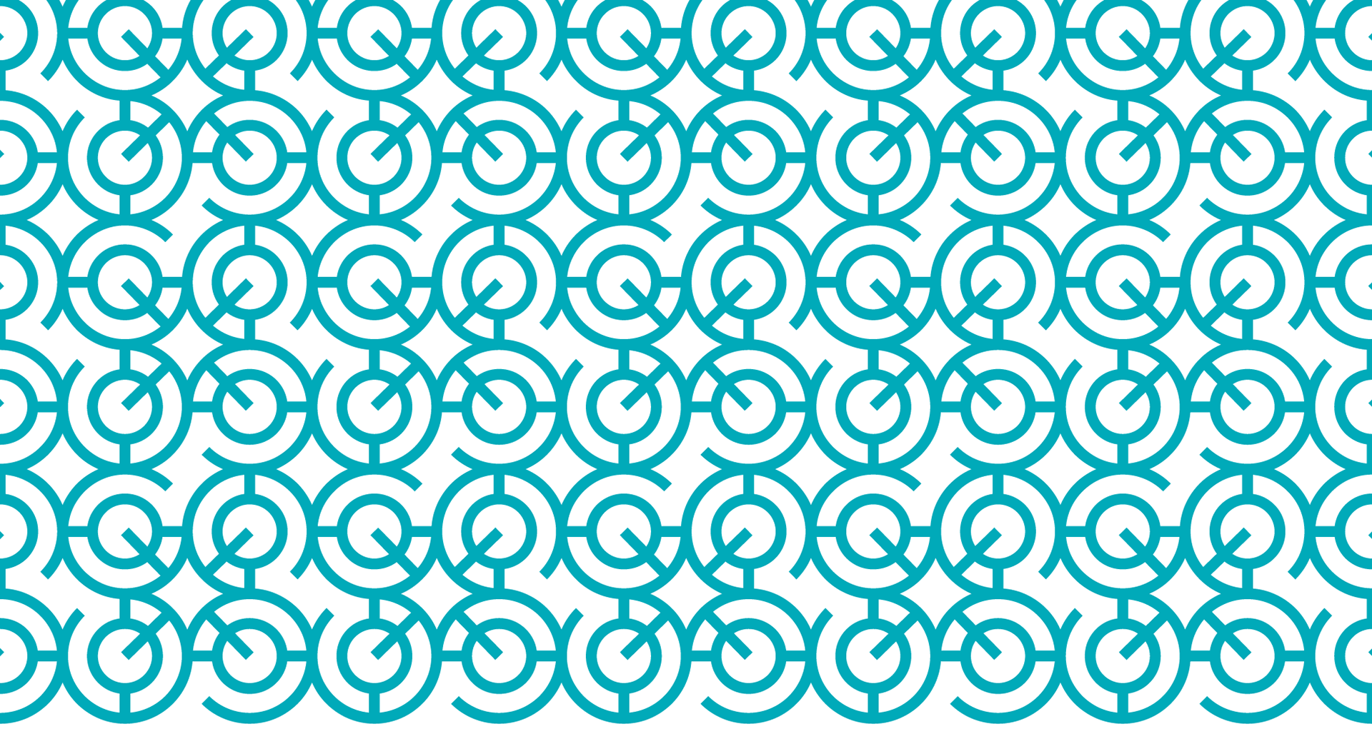
The symbol was created using the initials G and Q to resemble an atom (for chemistry) and a knob (for precision). It's simple, clean, and communicates what the company does without being obvious.
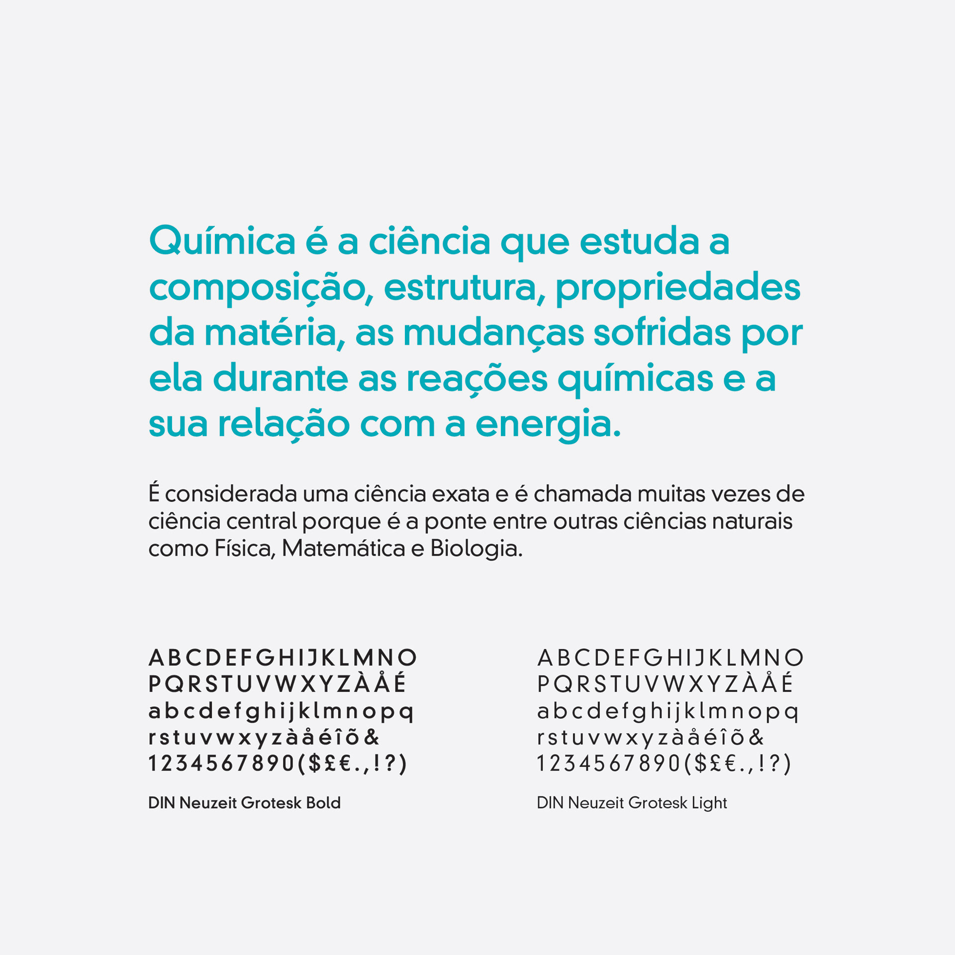
DIN Neuzeit, the typography of choice, has roots in european signage and works at both the biggest and smallest sizes, making the info on labels and reports very easy to read. It's geometric shapes are a perfect pair for the symbol.