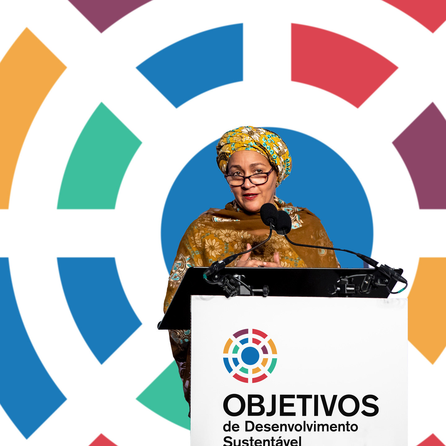
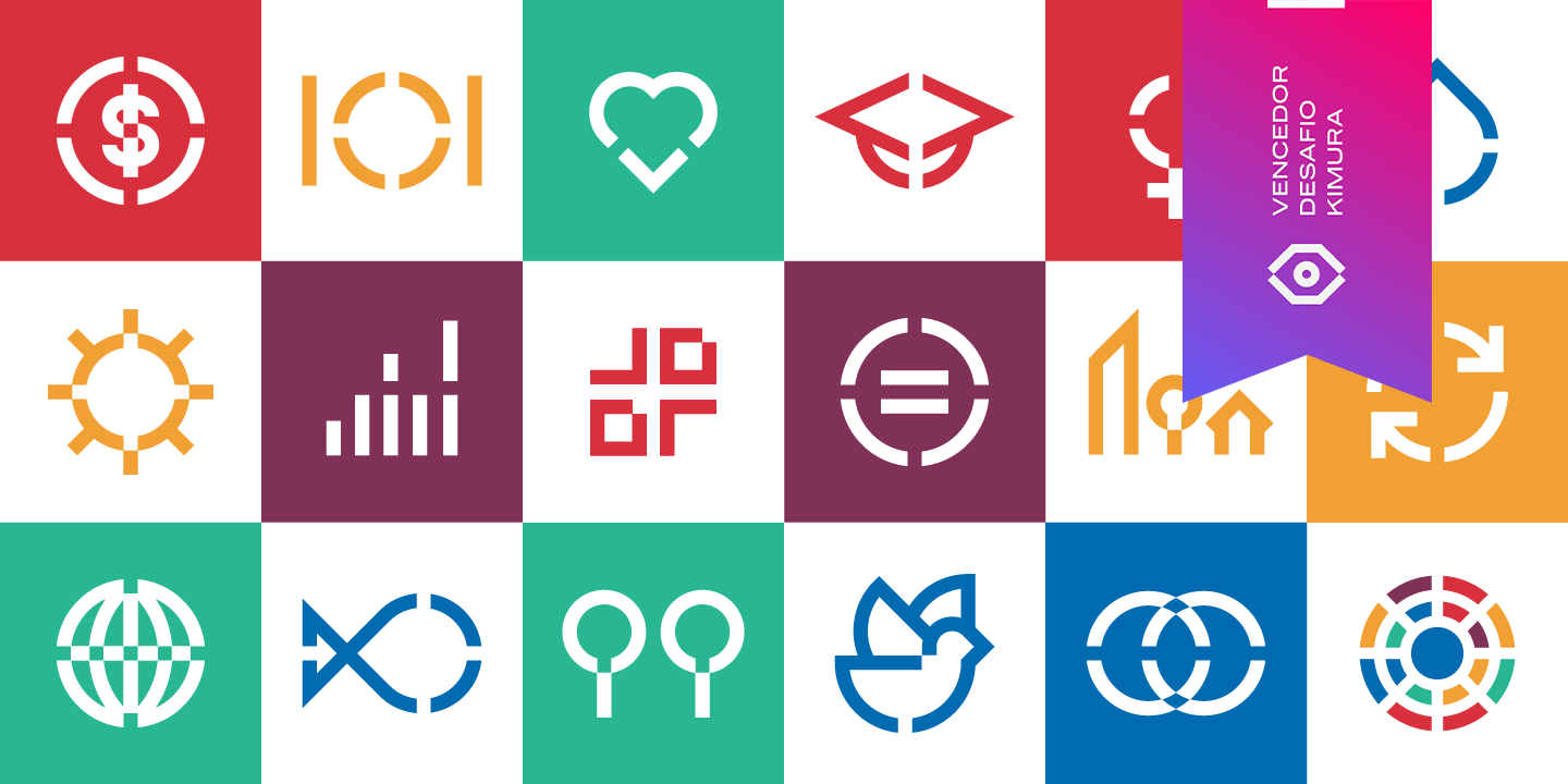
United Nations SDGs Logo Design Challenge Winner
I was one of the winners on the SDG Redesign Challenge. In total 8 graphic designers were picked by 8 professional graphic designers and won a Visual Identity course by Brazilian Graphic Designer Marcelo Kimura.
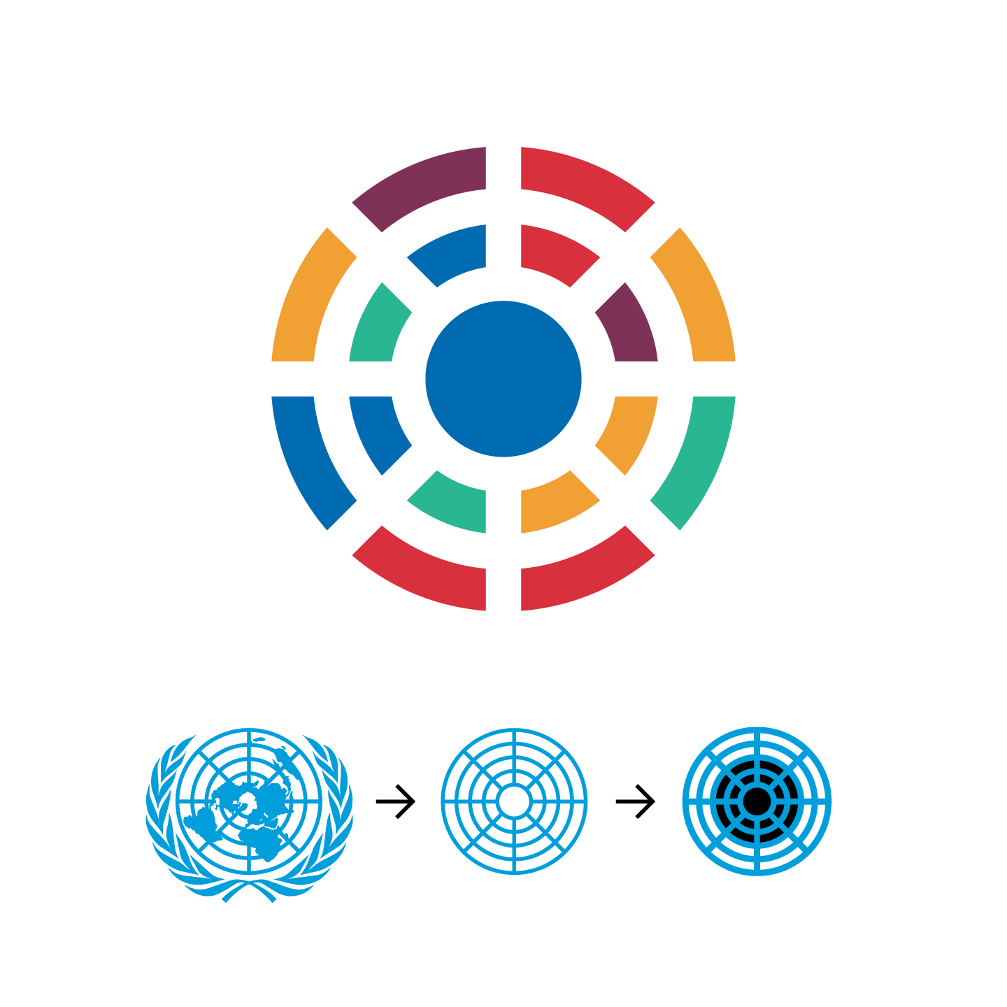
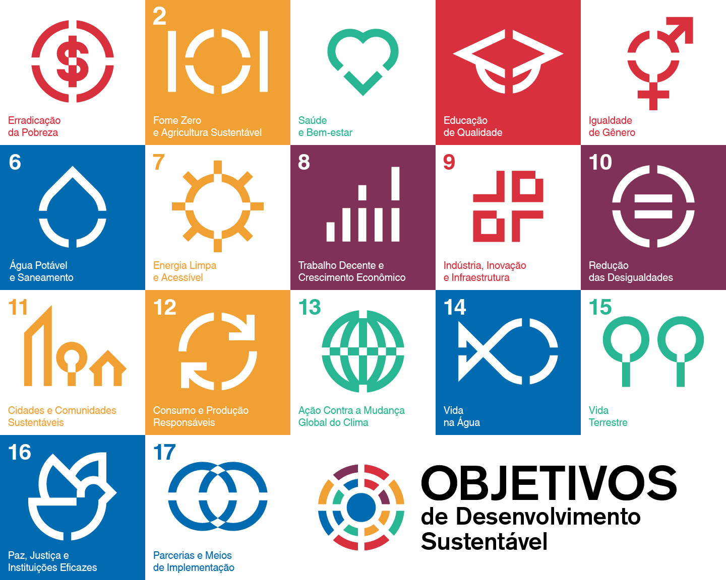
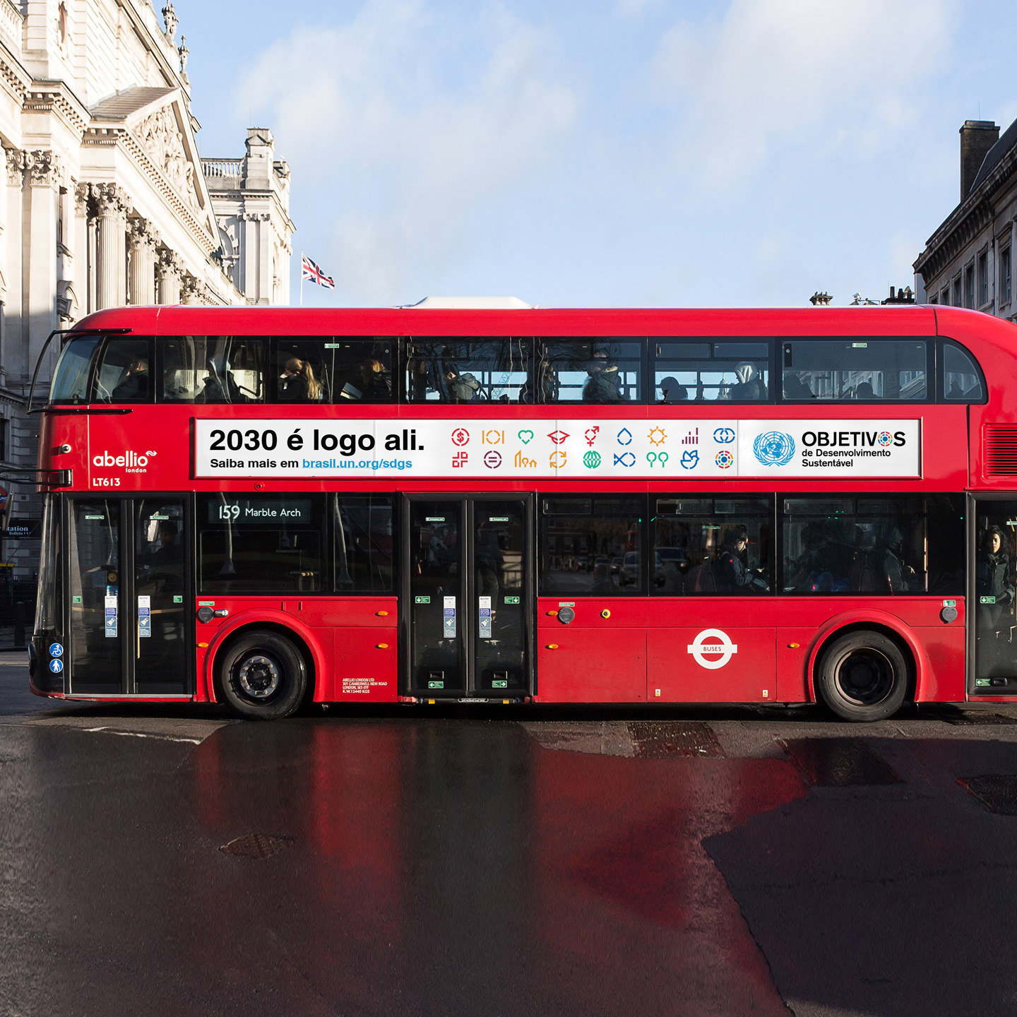
The challenge was to design, in 62 hours, a new brand and icons for the 17 Sustainable Development Goals (Objetivos de Desenvolvimento Sustentável). SDGs (or ODS in portuguese) were proposed by the United Nations to be adopted by 2030 to make the world a better and more sustainable place. They range from a wide variety of subjects from peace to gender equality going through several different themes.
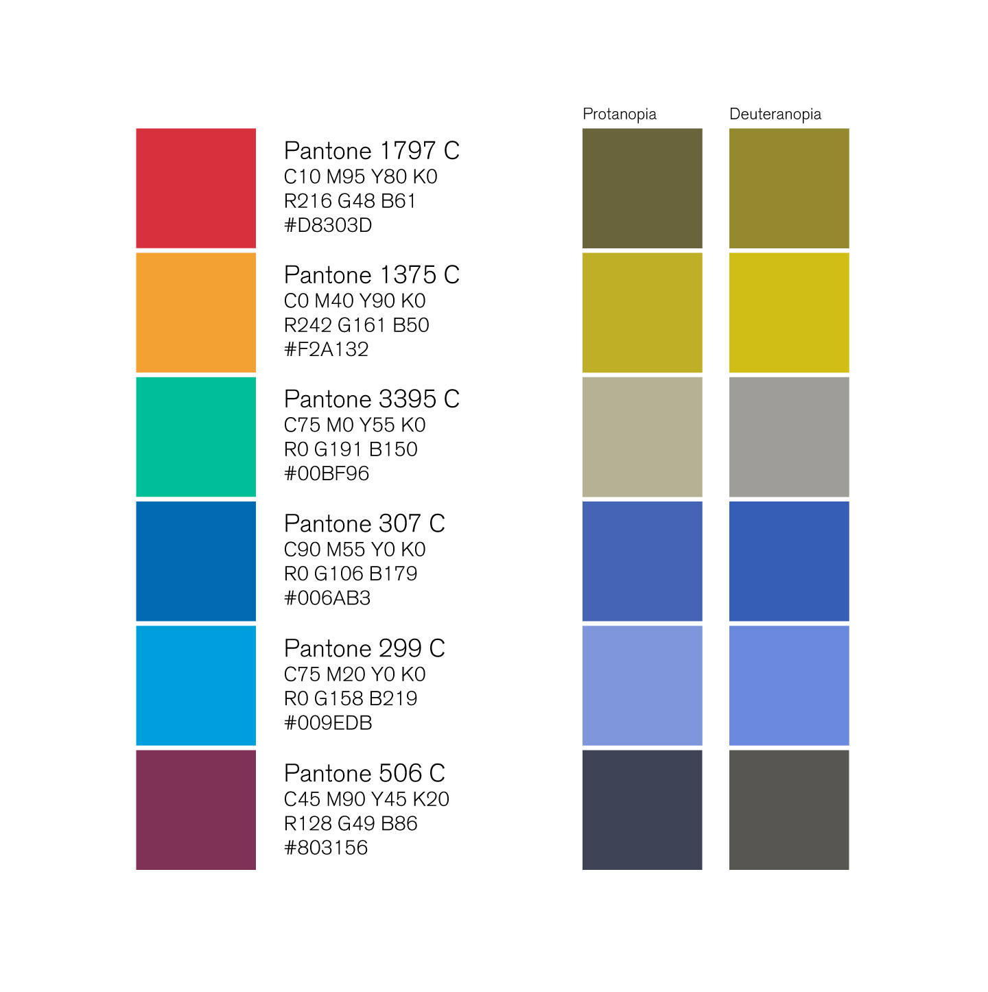
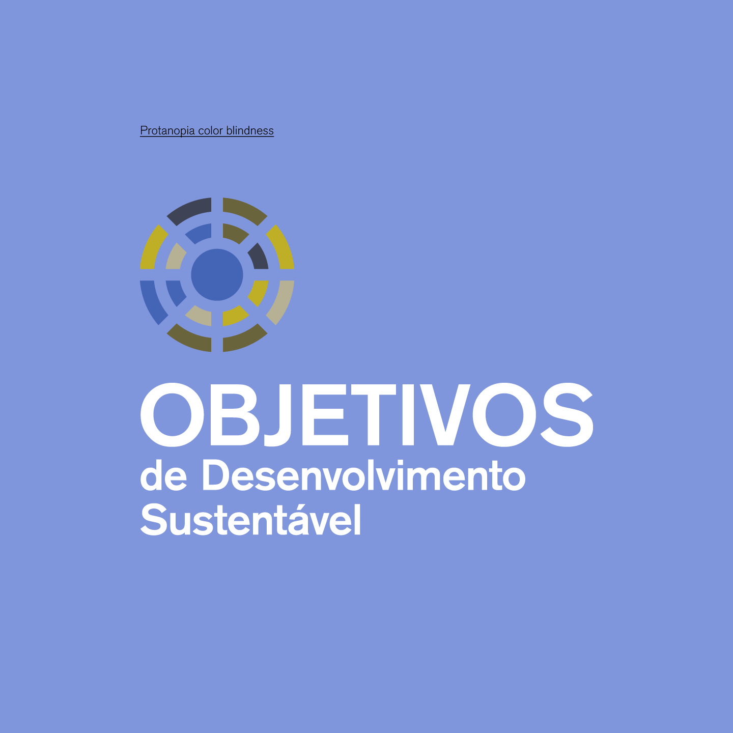
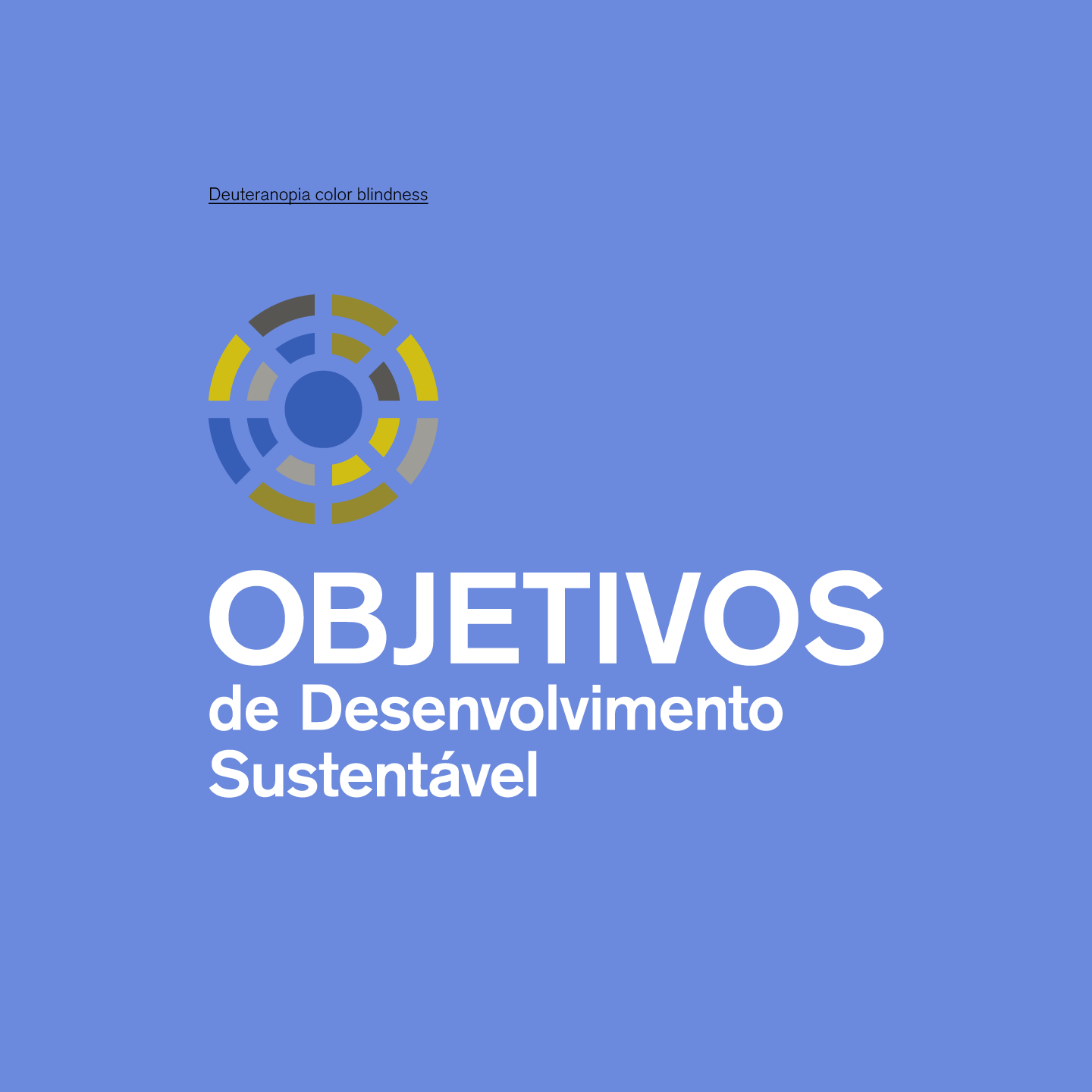
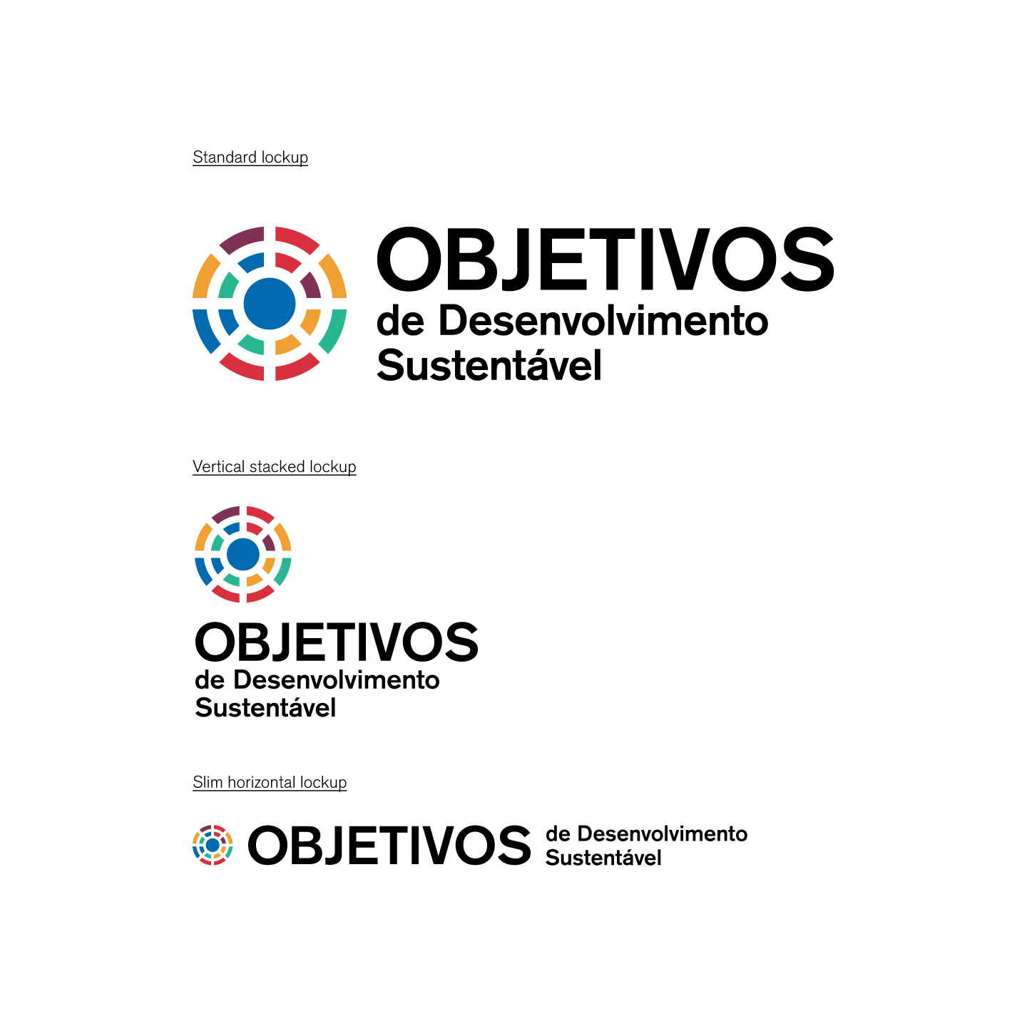
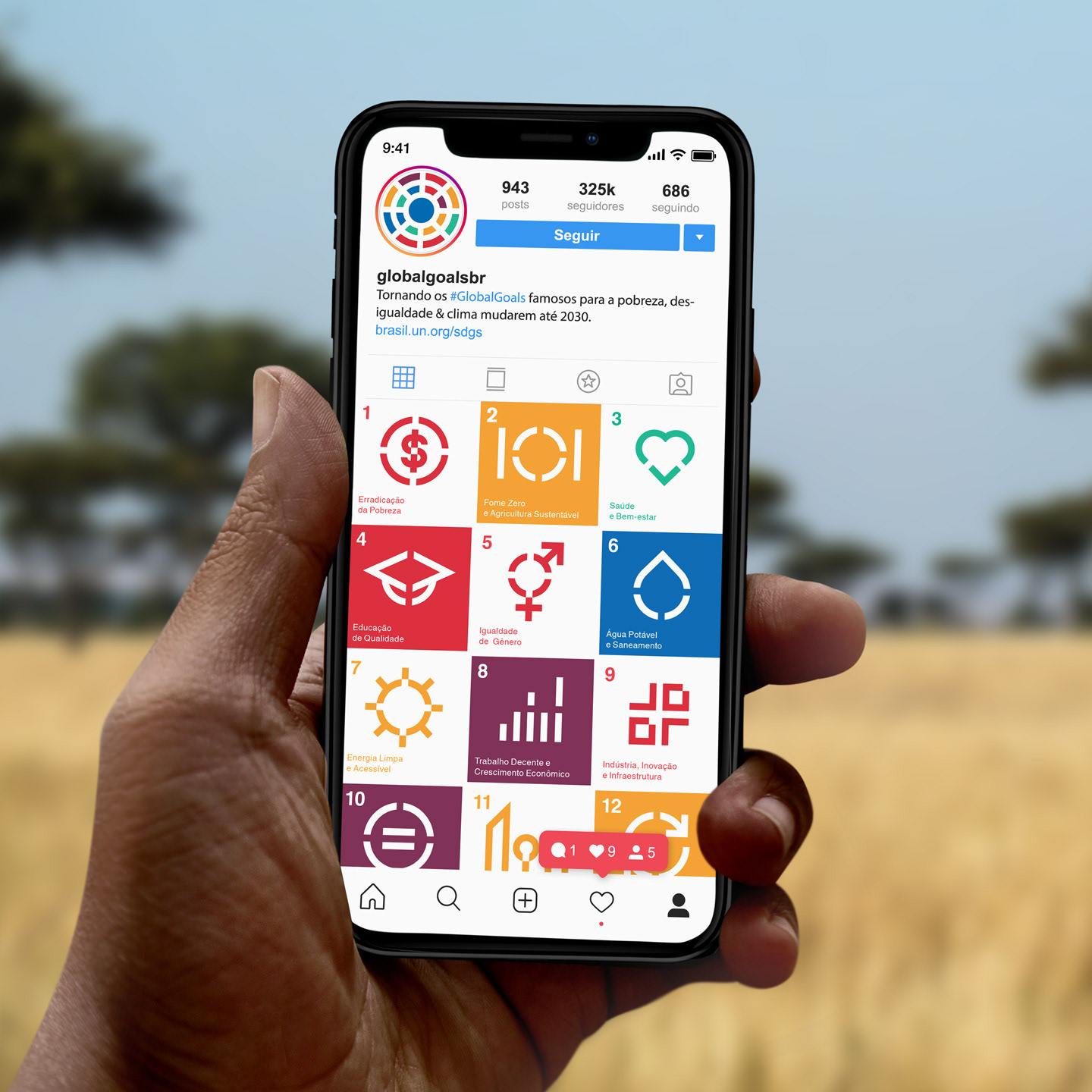
The visual identity and icons currently in use by the UN were lacking a unified design language as well as an accessible color palette. On the other hand, the 17 icons, although for the major part well chosen, were too complex or had too many elements. The other problem were the colors. They had specified 17 unique colors which didn't have enough contrast between them nor were distinguishable by color blind people.
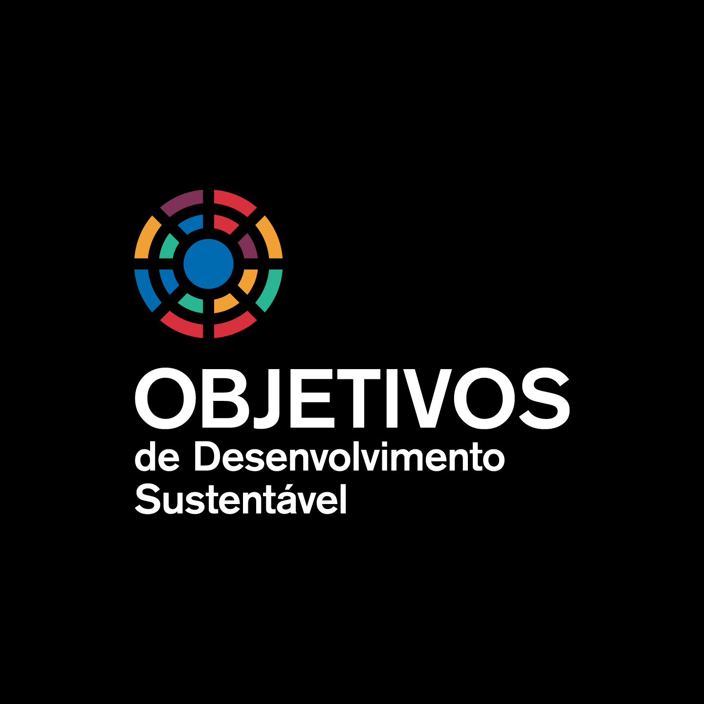
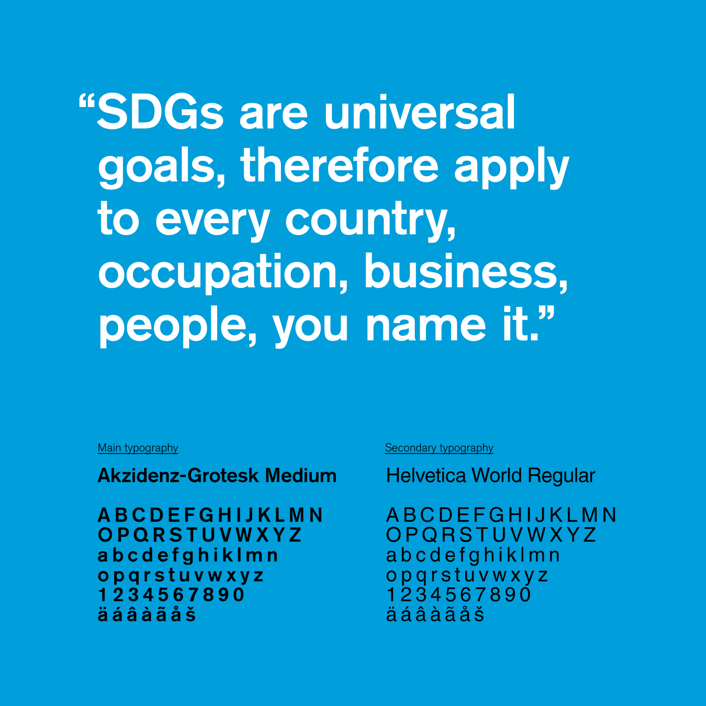
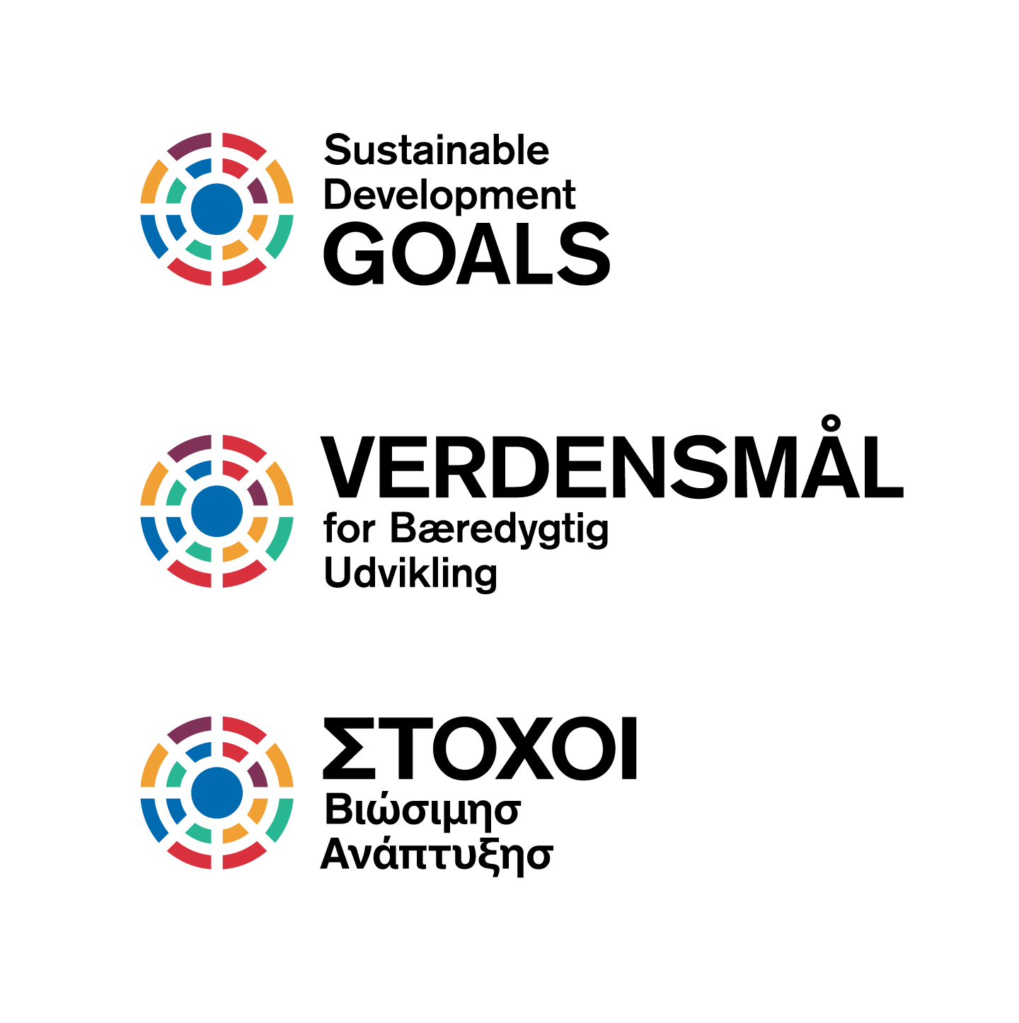
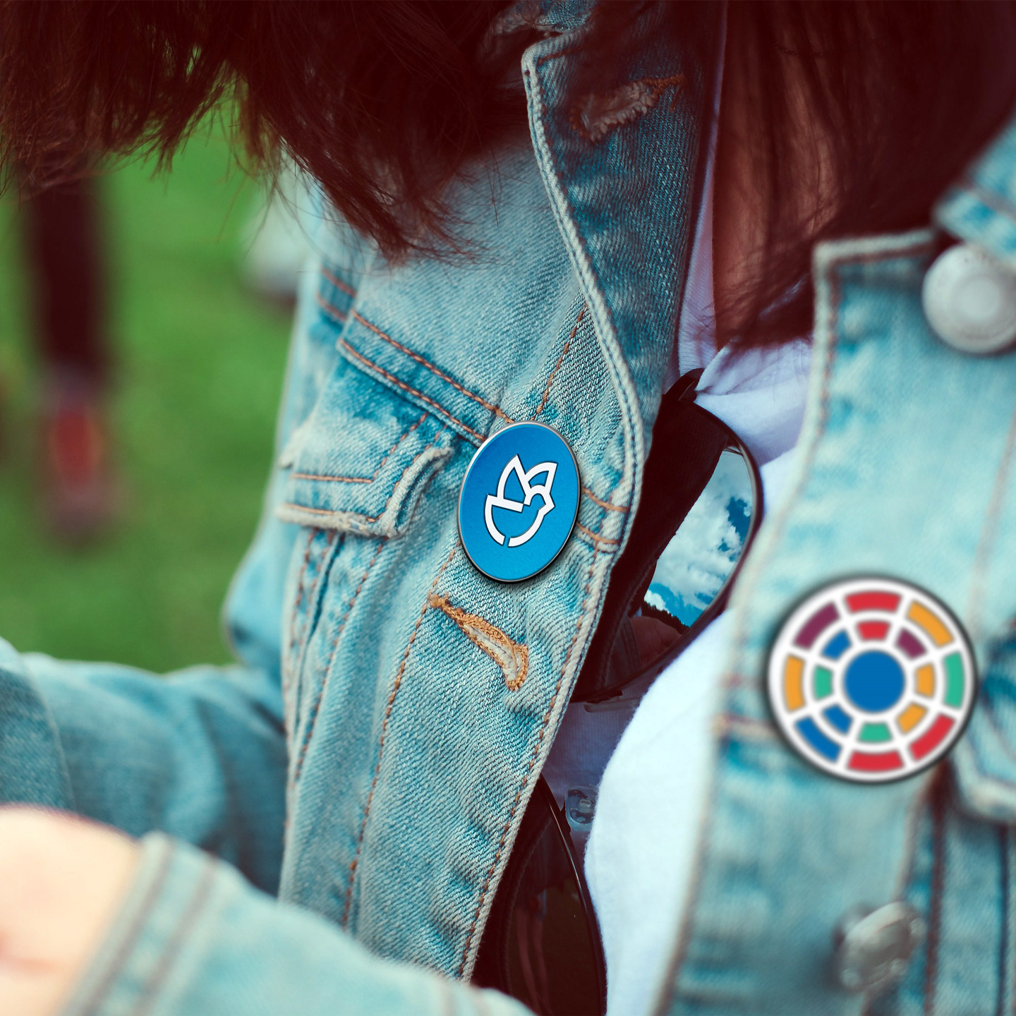
The proposed visual identity and icons were designed to be inclusive, easy to read and have a unified design language and elements, making it easy to know where the icons were from even when the SDG logo wasn't around. The main and supporting typography are inclusive as well, both having extensive glyphs for several different character sets. The icon set now uses a single element for each subject, making it easier to differentiate, even without the numbers.